Empowering users to confidently purchase dental insurance online
Client Unimed Corretora de Seguros
Agency Livework São Paulo
Year 2021
My role I led research, design, testing, developer hand off and quality assurance with the input of two other designers and the supervision of the client’s PMO
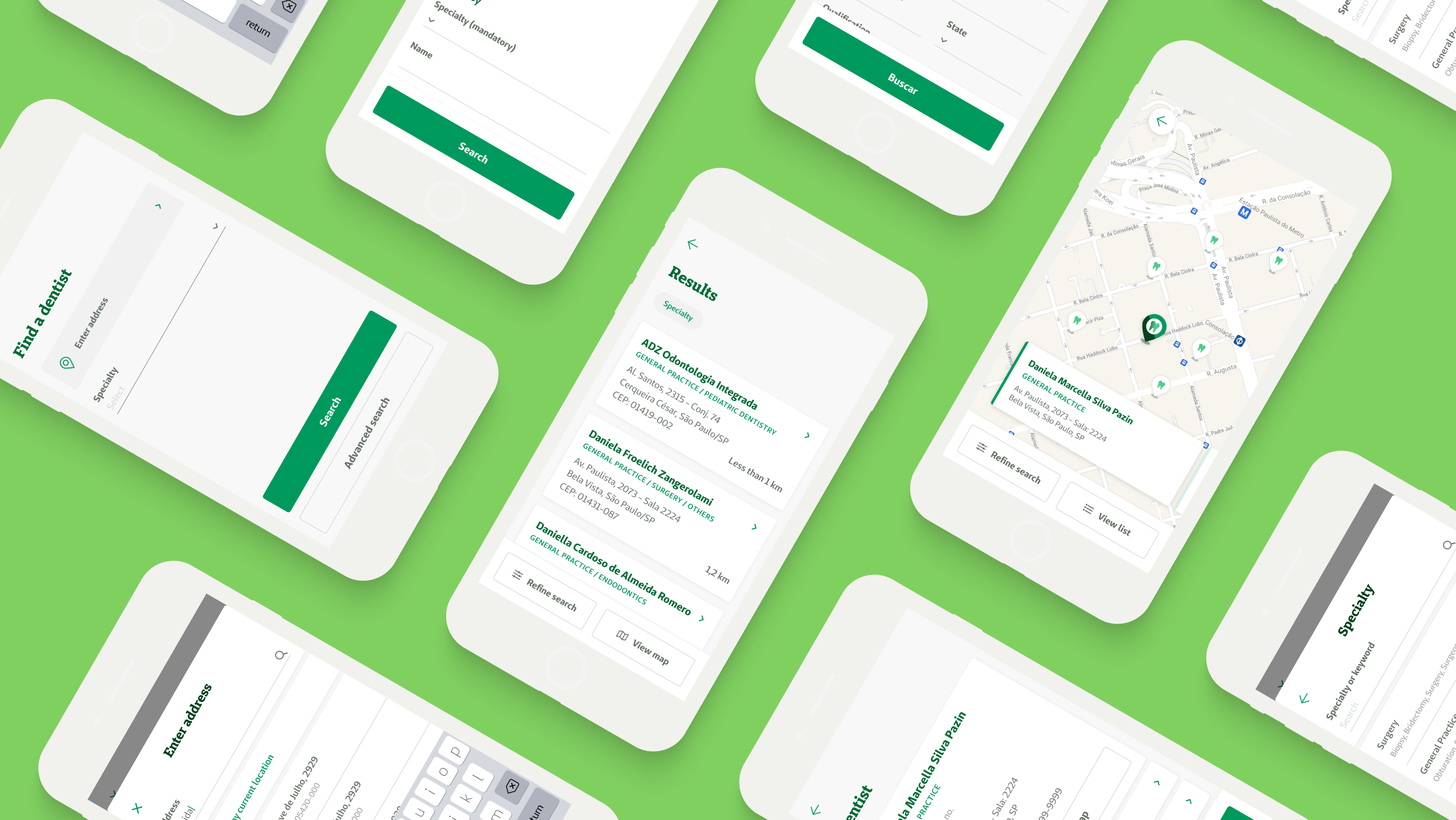
Overview of the mobile user interface.
Summary
Unimed Corretora de Seguros is the web-based, B2C insurance e-commerce of Unimed, the world’s biggest health cooperative. It offers a wide range of products, including dental insurance, which is the focus of this case study. As part of a team of three designers, we worked full time with the client to launch new products for online purchase, along with continuous improvement of the overall platform.
After an in-depth look at the support tickets received over time, we found out that 5% were a variation of “Are there in-network dentists near me?”. Aside from adding extra workload to the support analysts, this also represented a potential loss of sales for the client, seeing that the lack of this crucial information on the website frustrated users, detracting them from getting a quote and making a purchase.
As a temporary solution, I recommended adding a button on the product page to the already existing dentist search tool found on the company’s B2B website, which is focused on door-to-door insurance sellers. It was an opportunity to confirm the hypothesis that the dentist network was an important purchase factor for clients and to also justify the research, design, test, and development of a brand new, tailor-made dentist search tool for the Unimed Corretora website which followed soon after.
Impact
After the launch of the dentist search tool on the Unimed Corretora website:
- 8% increase of the click-through rate to the new tool, compared to the temporary solution;
- 25% increase of users getting a quote;
- 60% decrease in support tickets received about the dentist network;
Full case study ︎︎︎
Context
The Unimed Corretora website was launched in 2019 as an MVP, with the goals of validating the business model and confirming the hypothesis that users were willing to purchase insurance online. After doing so successfully, the goal shifted to provide a continually better experience to users, by adding new products and features over time.
In 2021 dental insurance was by far the best selling product of the platform, representing a large majority of the company’s revenue while the user interface remained almost untouched since its MVP days. This represented a chance to explore the full potential of this highly popular product.
Problem
While monitoring the most common asked questions over time, we noticed that tickets regarding the dentist network represented 5% of the overall support cases received over four months.
At that time, the current dental insurance page offered lots of information to help the user purchase the product, as seen below:
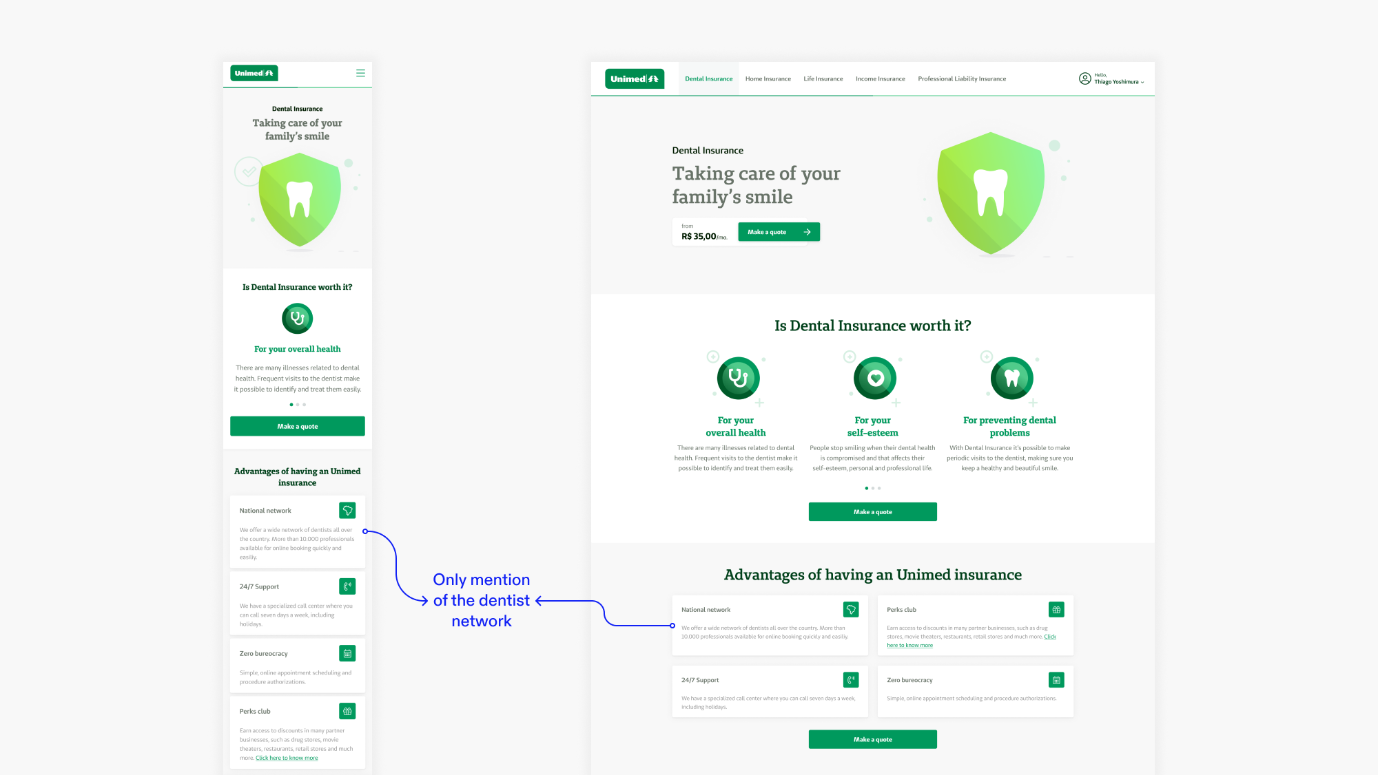
Initial product pages, mobile (left) and desktop (right).
However, it became clear that just mentioning a network of thousands of providers wasn’t enough. Users wanted to know exactly which in-network dentists existed near them. This conclusion helped shape the problem statement for this project: how can we empower users to confidently purchase dental insurance online?
Initial solution
To provide users with a technically simple and quick solution, I recommended adding a button on the product page to the already existing dentist search tool found on the company’s B2B website, focused on door-to-door insurance sellers. There, users could find the information they needed to know before making a purchase, but this solution had its shortcomings, which I will expand on further ahead.
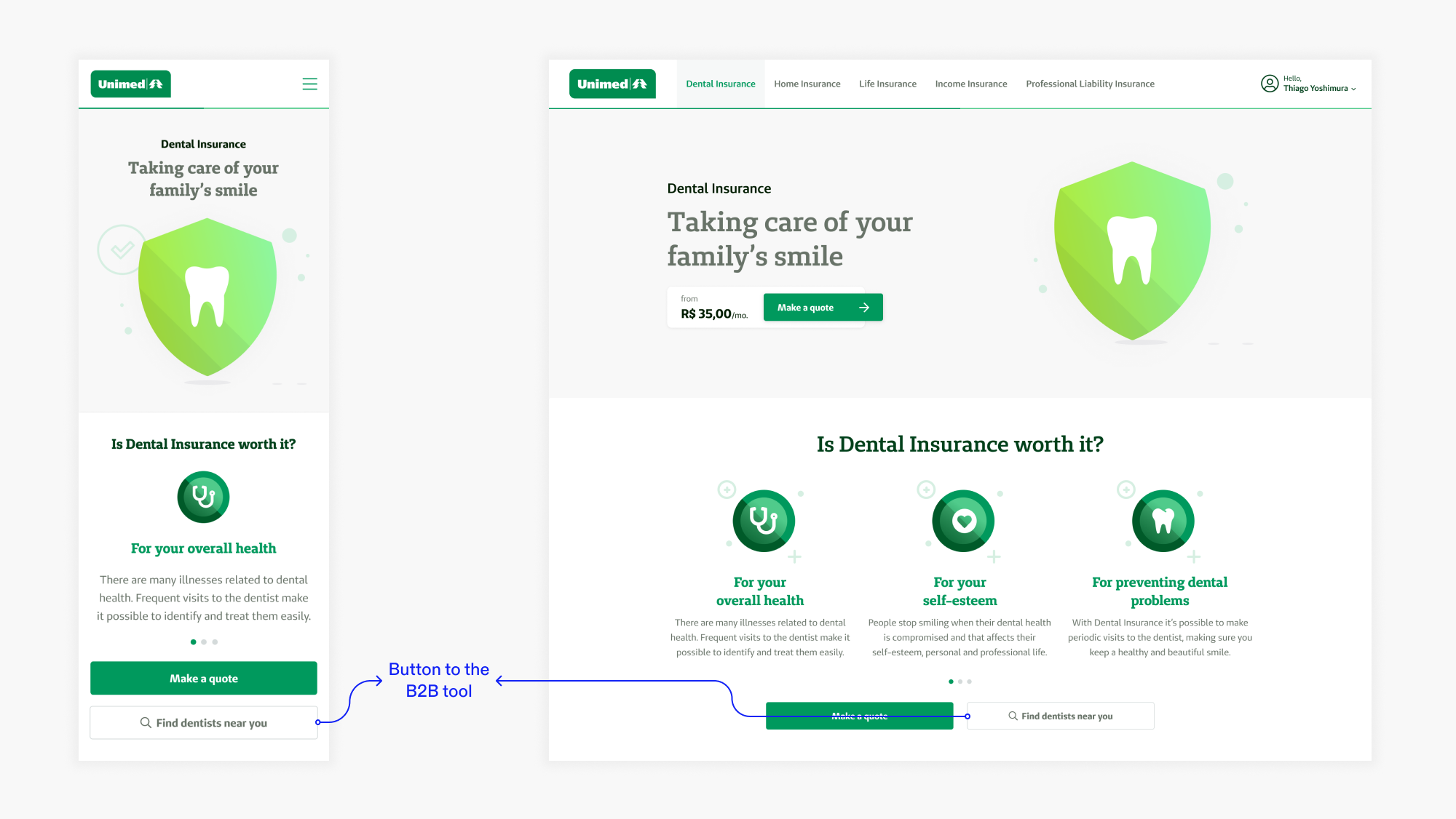
Product page, now with the button to the B2B dentist search tool.
Impact
A month after the launch of that solution, I found out through Hotjar heatmaps that it became the second most clicked button on the page, falling behind only the “Make a quote” button.This confirmed the hypothesis that the dentist network was an important purchase factor for clients, calling for a definitive solution for this problem.
Opportunities for improvement
Even though the initial solution was successfully received by the users, we were still getting support tickets regarding information on the dentist network. I had a few assumptions about this:External website
When clicking the button, users were taken to a completely new website. Even though it was under the Unimed company umbrella, it was another brand, so it might have confused some users and even prevented others from coming back and fulfilling the purchase.Inadequate user experience
The B2B tool was built with a different type of user in mind and it included hundreds of options that were not available for B2C clients. It offered an overall very complex experience, preventing some users from finding the information they were looking for.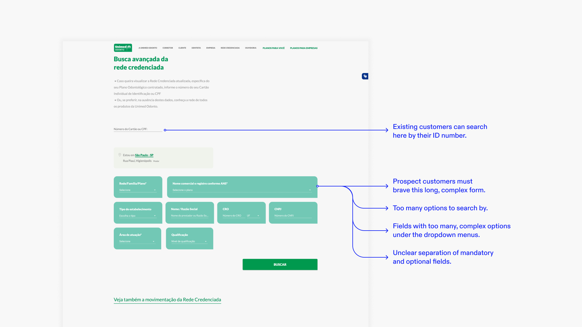
B2B search tool entry page.
Definitive solution
Learning from the initial solution, it became clear that adapting the search tool for the client’s unique context was the way to go. It meant building it from scratch inside the website, simplifying the navigation flow, and contextualizing the field options.
Benchmarking
The first step was to analyze the B2B tool to understand how it worked, its navigation flow, and available information to properly consume the dentist data through its API. I also observed its usability issues to not repeat the same mistakes and find improvement opportunities.Later, I broadened the scope and analyzed similar search tools from other insurance providers, dental and medical, from Brazil and other countries, in search of best practices and inspiration to create an efficient and familiar tool.
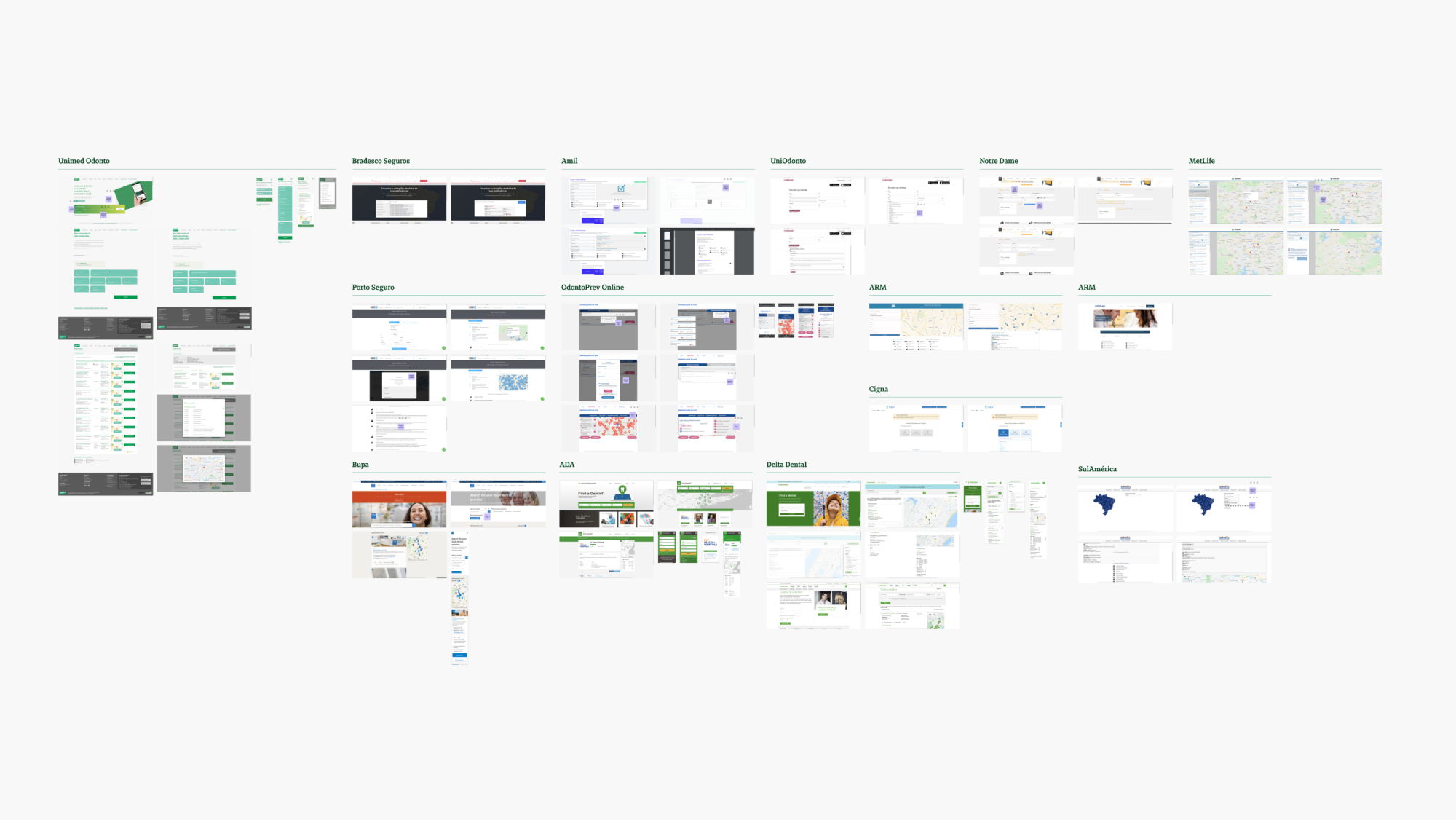
Reference board with search tools from Unimed and other companies.
User flow and interface
Based on the benchmark, I came up with a user flow and explored some alternatives for the interface. After some pencil sketches, I dived straight into high-fidelity prototyping, taking advantage of the fact that our design system already had almost all the necessary components.Then, I presented the designs for a few rounds of critiques from other designers, developers, and the client’s PMO before arriving at an ideal version, ready for testing:
Entry point
The new search tool can be accessed from the same button that previously directed users to the B2B website since it’s where they already expected this information to be found. It opens as a modal, making it possible to easily go back to the previous page, without losing any progress.On mobile: the modal appears full screen to make the most of the space, but still follows the principle of an easy return to the previous page through the “X” icon.
On desktop: the modal appears on top of a dark overlay, signaling to the user that the previous page is still there.
search
The goal here is to request as little information as possible to present the search results. It starts by requesting access to the device’s location. That way, the “Search address” field comes pre-filled.The user only needs to fill the desired dental specialty - this mandatory field was a constraint added by the pre-existing API. For users who might not know the technical terms, it’s possible to search by keywords and the interface will hightlight the correct specialty.
If necessary, the user can narrow the search down by clicking “Advanced search” and filling in the appropriate information.
On mobile: when selecting address and specialty the user is taken to another screen where all the information can be displayed and selected more easily.
On desktop: here both fields can be filled through a dropdown menu since there is enough space for that.
results
The results can be viewed in a list or on a map, which way the user prefers. Here it shows the primary information about a dentist: name, specialties, address, and distance.On mobile: the user can alternate between list and map view by clicking a button on the bottom of the screen.
On desktop: the list and the map are shown side by side, taking advantage of the screen real estate.
If the user wants to narrow down the search, it’s possible by clicking “Refine search”. There, the user can change the address, order the results by distance or alphabetic order, and filter by information such as name and qualifications.
The bottom sheet is fixed on the screen, always visible, and contains the starting price for a dental plan and a call to action inviting the user to make a quote.
Dentist profile
After choosing a search result, the user arrives at a page with all the information about that dentist. The primary information is shown at the top of the screen while secondary information is kept under accordion menus so that the user can quickly scan through the whole page and select to reveal what is most relevant.The bottom sheet is fixed on the screen, always visible, and contains the starting price for a dental plan and a call to action inviting the user to make a quote.
On mobile: dentist pages are shown one by one.
On desktop: the dentist page is shown on the right side of the screen, while still keeping the results visible. This way it’s easier to view the complete information of multiple dentists quickly.
Usability testing
Even though the prototype had been validated by my peers, the developers, and the client, it still needed validation by the users. Due to lack of time, budget, and the COVID-19 pandemic, I chose to conduct a remote usability test with a Figma prototype through Maze. These factors also led me to choose the guerilla model of participant recruitment.
In total, 35 people participated in the test.
Test goals and questions
The tool offers two ways to search for a dentist: by location and by name. With these use cases in mind, two missions were defined:- “Imagine that, when buying dental insurance online, before making a quote, you decide to take a look at the dentist network available near you. How would you do it?”
- “Now, let’s imagine that you would like to know if a specific dentist near you is available on the network. Let’s suppose the dentist’s name is Pedro Silva. How would you go about it?”
For testing purposes, the participants were informed that it wasn’t necessary to include an address, as it would be added automatically by the test.
At the end of each mission, two more questions were asked to capture a broader perception of the user experience from the participants:
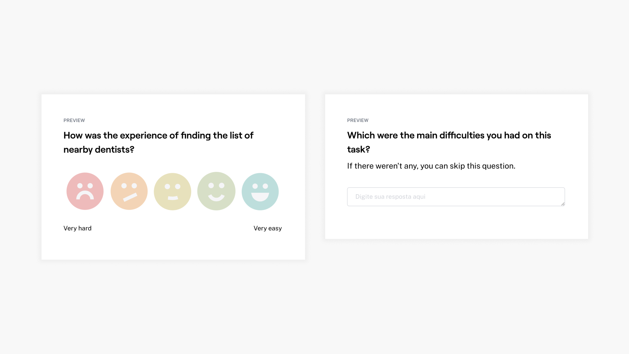
Questions 1 and 2.
Outcomes
Both tasks had more than an 85% rate of success, which means that a big majority of the users took a direct or indirect path into solving the mission with a low average time of completion.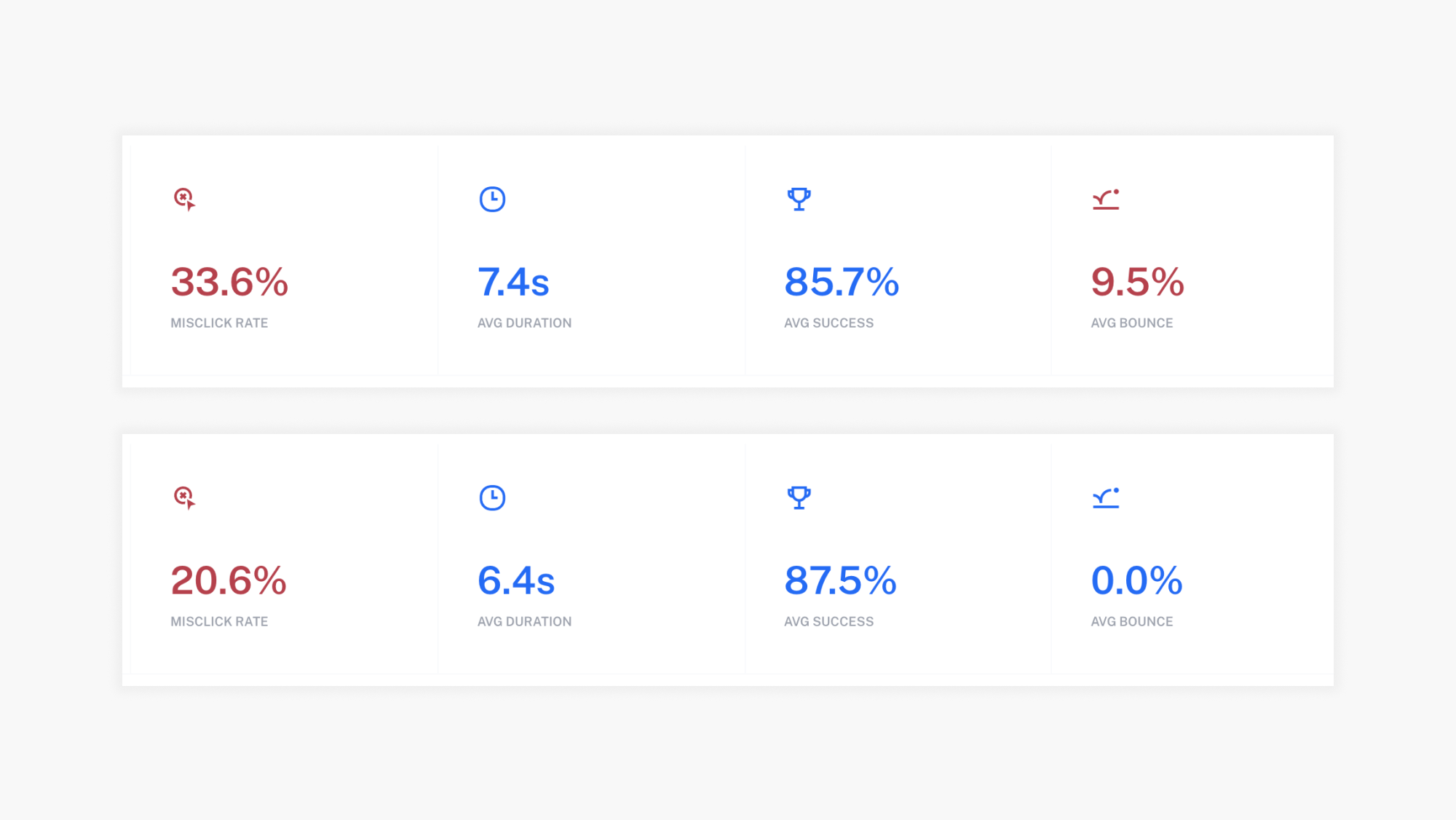
Results from Maze.
At the same time, both had around 25% of misclicks. This could be due to several factors and didn’t seem like a cause for concern given the high success rate.
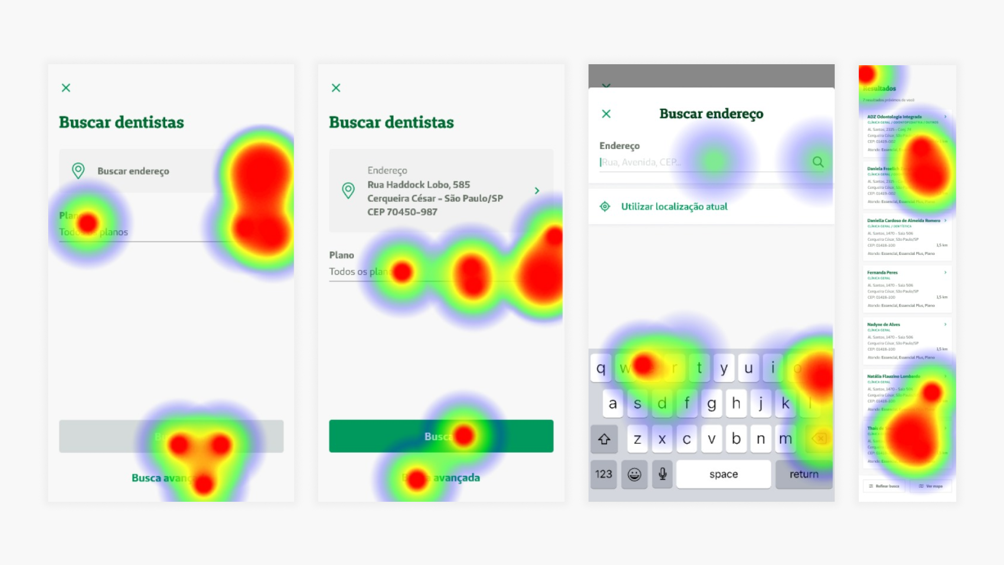
Heat maps from Maze.
As for the secondary questions, most users rated the missions “1 - very easy” or “2 - easy” and a few expressed specific difficulties, mentioned below.
Opportunities for improvement
Gladly, the overall test was very successful. After analyzing the results, these were the most relevant pain points mentioned, listed by impact and effort:High impact, low effort / Apply immediately:
- Make the “Advanced search” button more visible: some participants complained about it being hard to find.- Make the “National network” card on the product page clickable: some participants tried clicking on it instead of the “Find dentists near you” button.
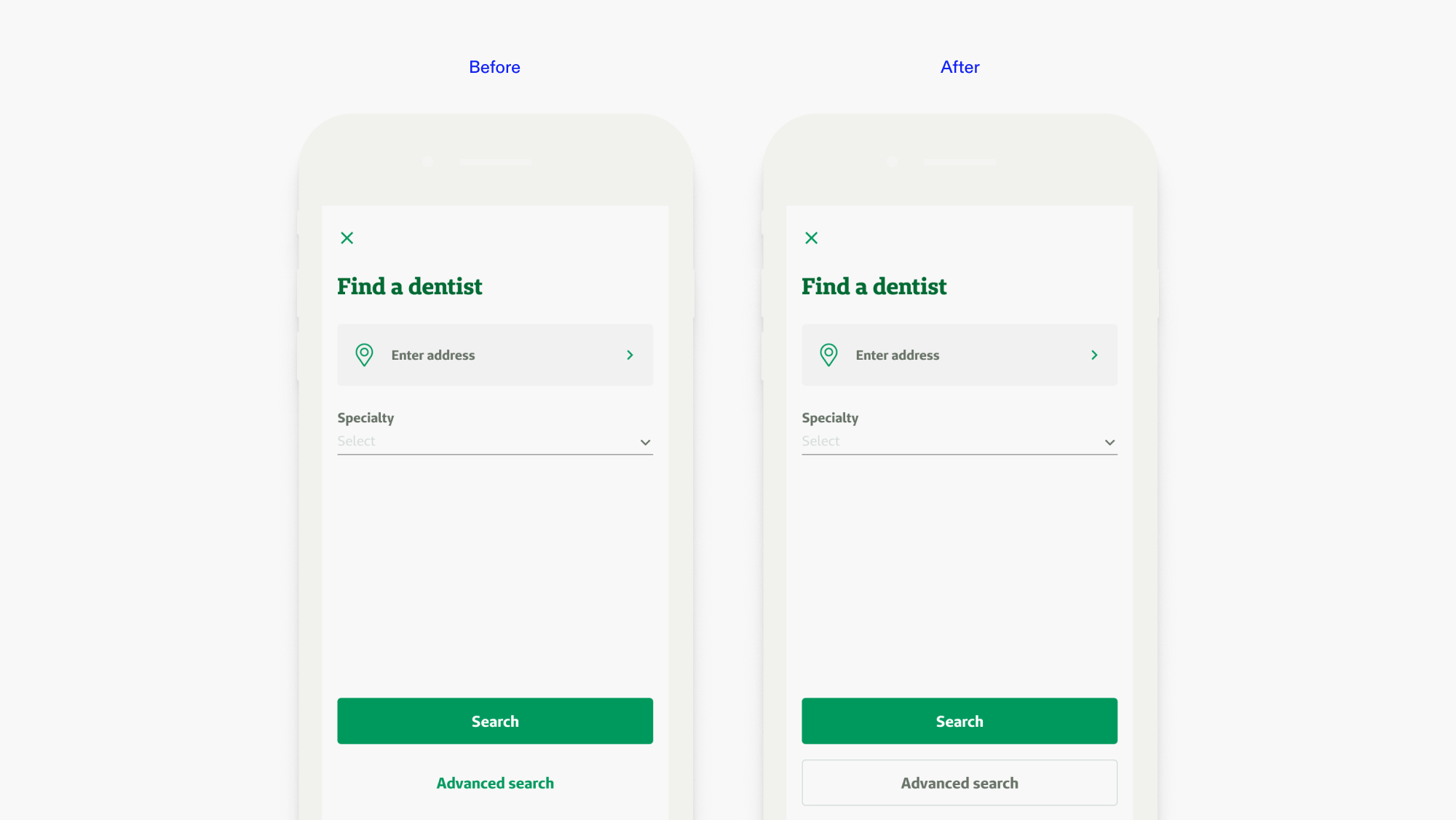
Before and after changing the “Advanced search” button based on the usability test findings.
Low impact, low effort / monitor user behavior:
- Try positioning the “Find dentists near you” button in a different place: some participants had a hard time finding it on the product page;- Find another name for “Advanced search”: some users didn’t know what it meant;
- Add “Search for another dentist” and “Return to the homepage” buttons on the dentist page: some participants suggested this.
Development and launch
After making the aforementioned adjustments to the interface, I handed it off to the developers, along with the relevant user story.
Check the live version by clicking here, then selecting the “Busque a rede credenciada” button (available in Portuguese only).
Impact
As mentioned at the beginning of this case study, after the launch of the new dentist search tool:
- 8% increase of the click-through rate to the new tool, compared to the temporary solution;
- 25% increase of users getting a quote;
- 60% decrease in support tickets received about the dentist network;
The data was found through user analytics tools such as HubSpot, Hotjar, and Google Analytics.
Next steps
- Continue monitoring the use of the dentist search tool and overall dental insurance purchase experience through user analytics tools to look for further improvement opportunities;
- Study the possibility of adding a shortcut to the tool on other points of the purchase journey, such as the insurance quote page.