Enhancing usability in a service portal through continuous research
Client Bosch
Agency Livework São Paulo
Years 2021-2023
My role I co-led the end-to-end UX research and redesign of the portal, collaborating with the other designers in the team

Overview of the redesigned service portal.
Overview
Bosch Global Services (GS) set out to centralize internal services such as Human Resources, Finance, and Logistics into a single platform called the Global Business Services (GBS) portal. Built on ServiceNow, the portal was functional but lacked user-centric design, making it difficult for employees to find and request services.
Bosch invited our team at Livework to lead continuous UX Research to uncover user needs, validate workflows, and guide the portal’s redesign.
Discovery
The research activities below focused on understanding how people used the GBS portal, spotting key pain points and opportunities for improvement.
Interviews
Objective: Understand daily tasks, tools, and challenges faced by employees and support agents, while identifying inefficiencies in service requests and opportunities for improvement.
My Approach:
- Co-led 22 semi-structured interviews across HR, Finance, Logistics, and Purchasing.
- Collaborated on scripts, conducted sessions, and synthesized insights in Miro through affinity diagramming.
- Revised existing personas and created employee journey maps to better represent user needs and pain points.

Final top insights in the Miro board.
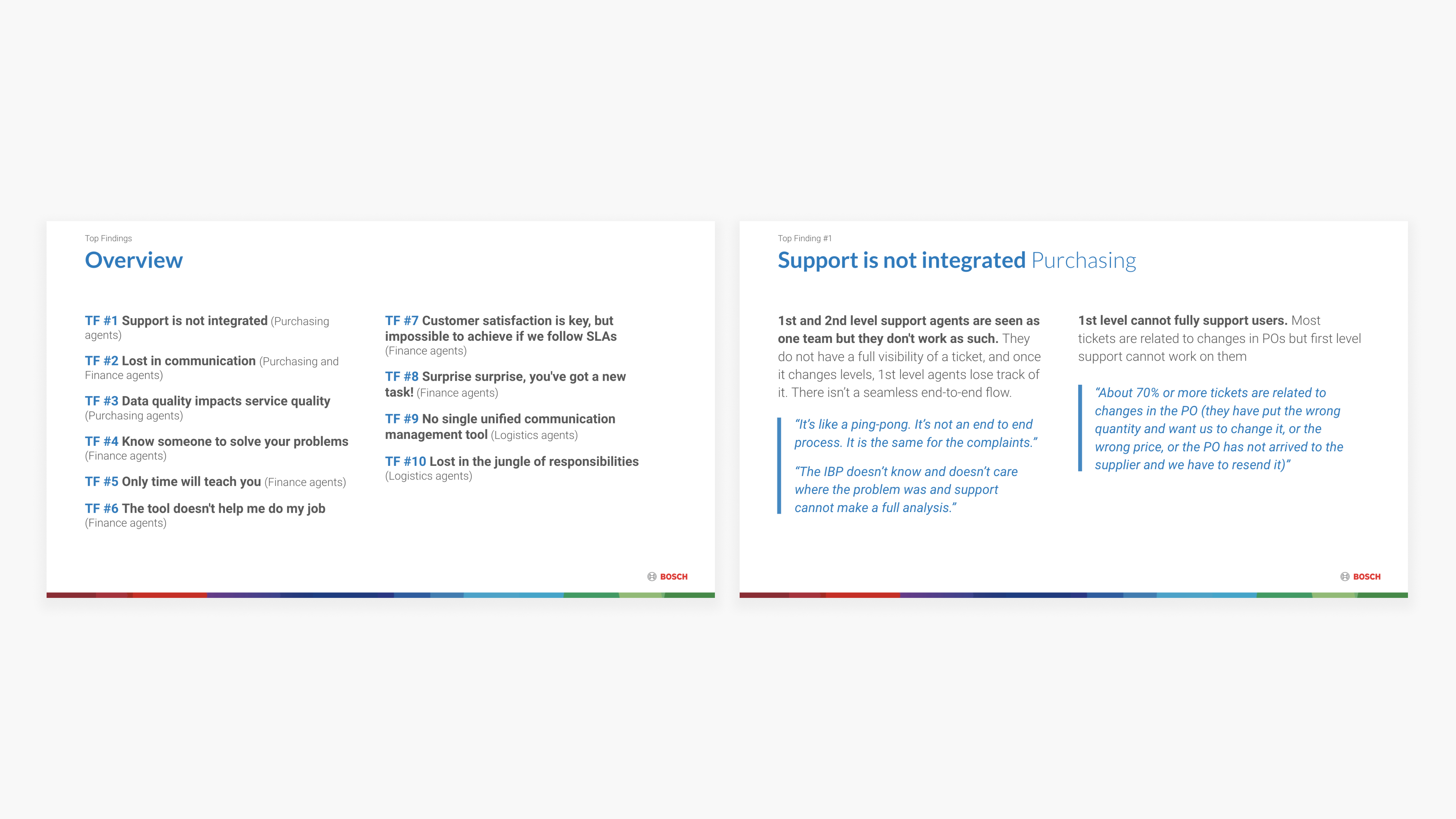
Top insights summary and example of an insight slide.
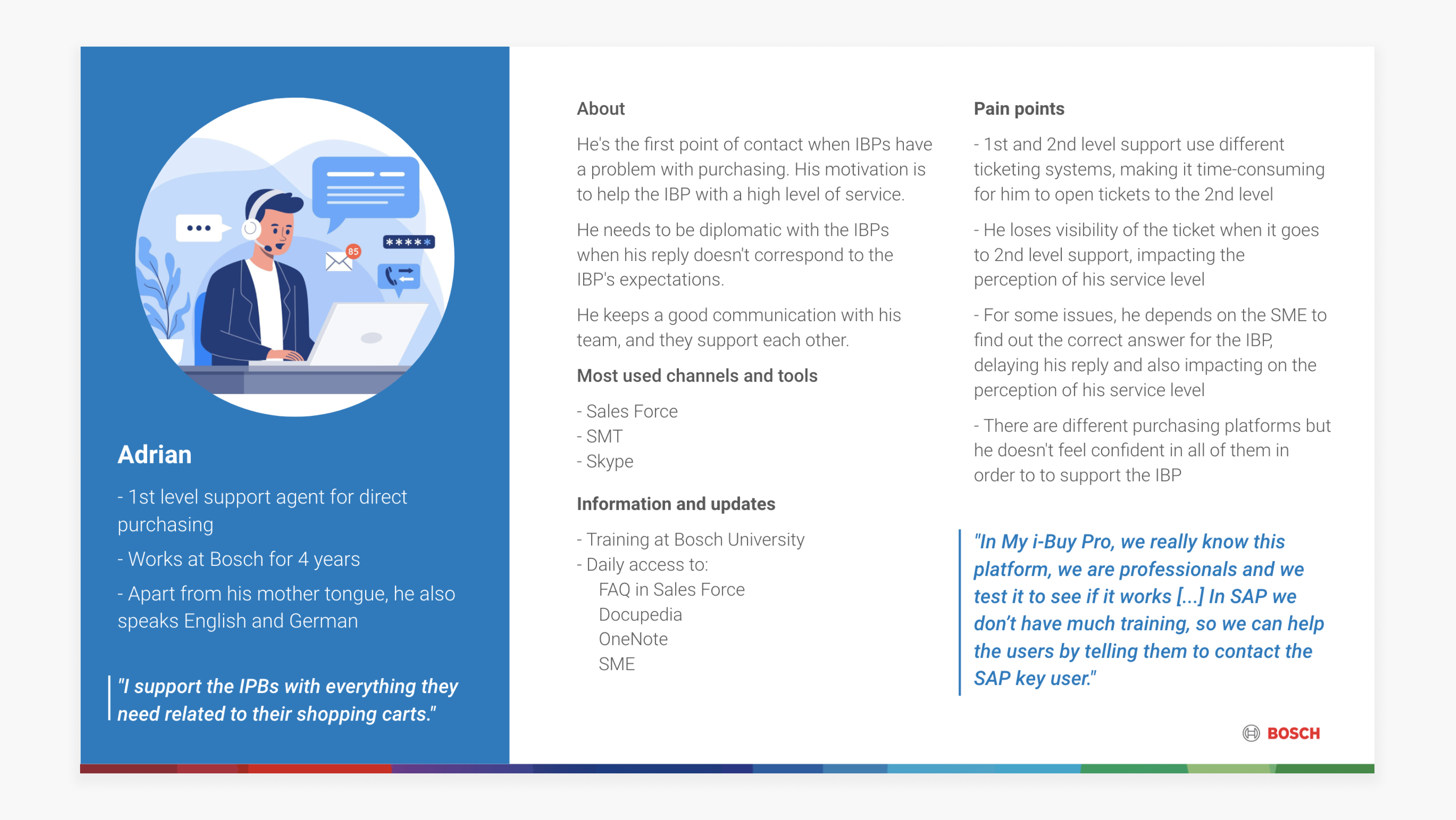
Example of a revised persona.
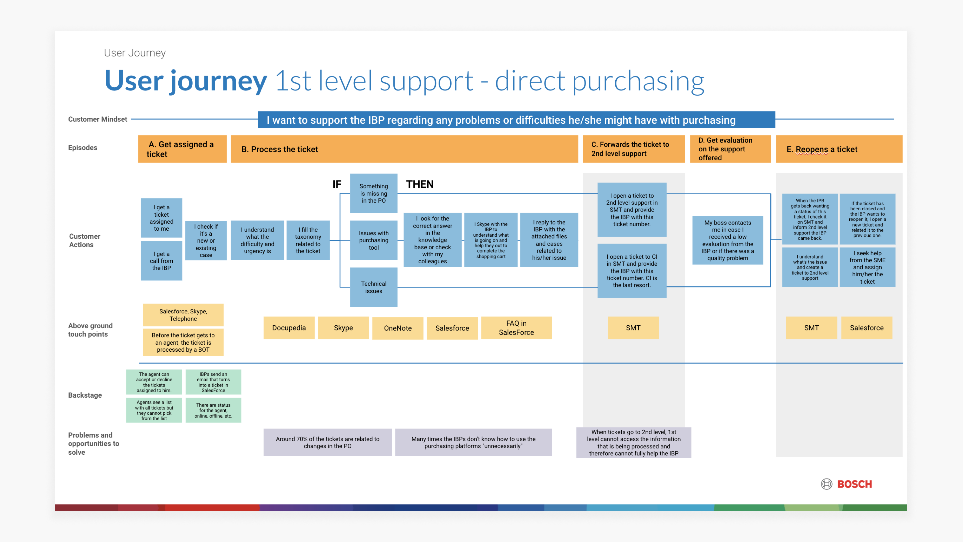
Example of a user journey - first-level support for direct purchasing.
Card-sorting Workshop
Objective: Improve navigation and clarity by reorganizing how services were named and grouped in the portal.
My Approach: I facilitated a remote Miro card-sorting workshop where employees reorganized services, proposed clearer names, and provided input on navigation, visibility, and language support.

Screenshot of the Miro board after the workshop was conducted.

Close-up of one of the groups’ suggestions.
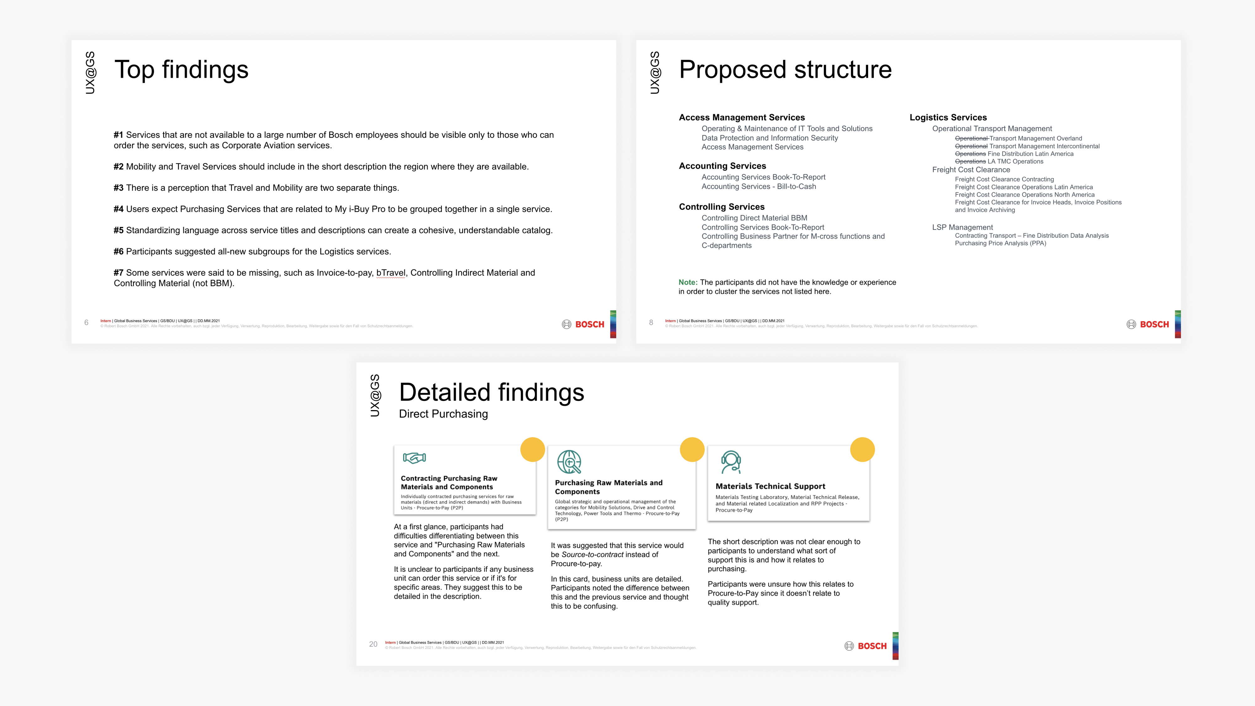
Screenshot of the slides - top findings, proposed structure and detailed findings.
Usability Testing
Objective: Identify usability gaps in the navigation, search, and request handling in the GBS portal that could hinder adoption.
My Approach:
- Co-led 10 scenario-based usability tests with employees from different divisions.
- Collected observations, user quotes, and rated issues by severity.
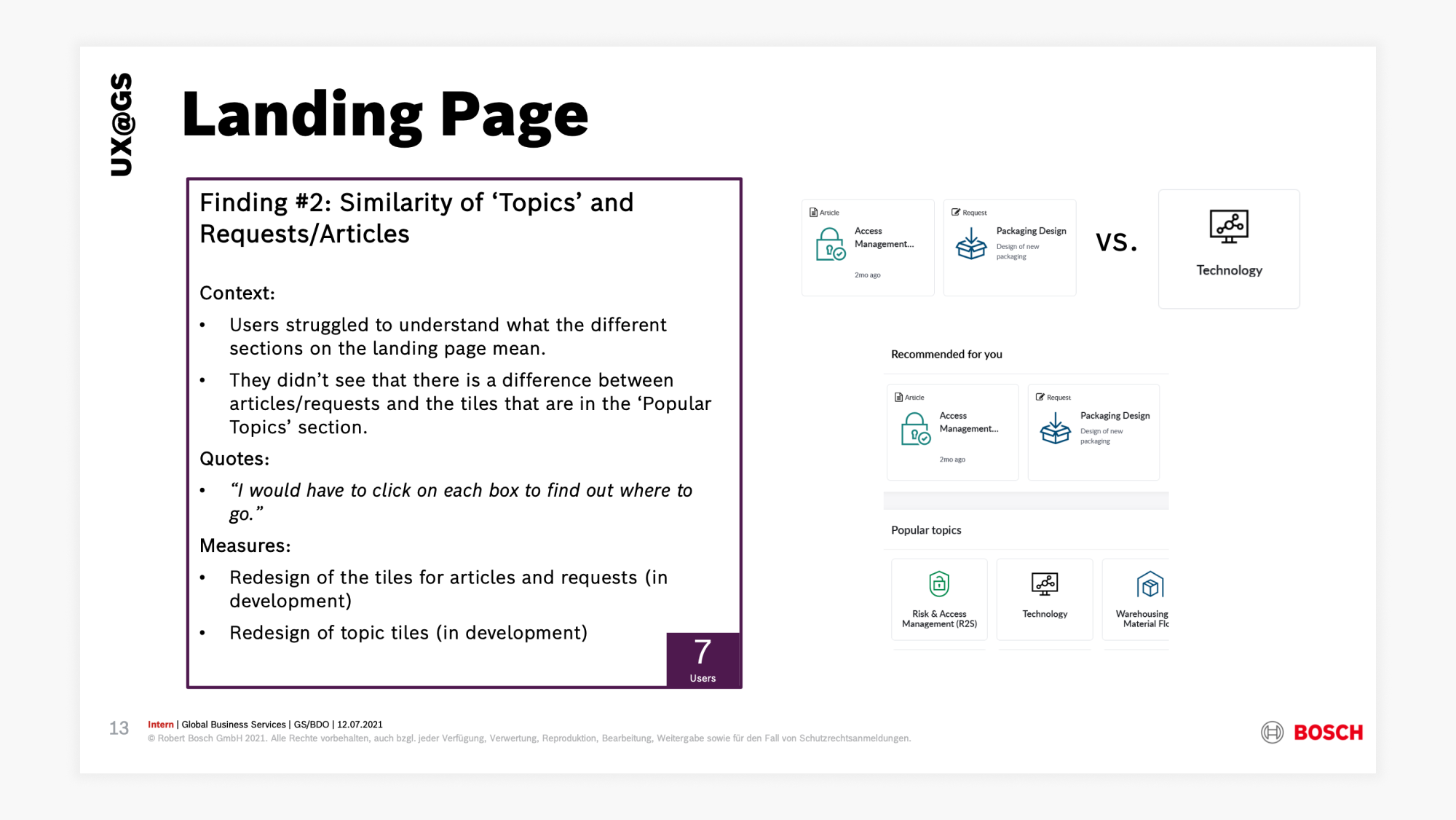
Insight with description, quotes, suggestions, and an image to illustrate the point.
In addition to the test findings, an analysis of the portal revealed several inconsistencies with Bosch’s brand guidelines and design system.
Redesign
At first, stakeholders saw no need for a redesign. Presenting clear evidence of usability issues was the turning point that secured their approval to move forward.
I translated these findings into actionable design requirements and worked closely with designers to ensure the redesigned portal was both user-centered and aligned with Bosch’s visual standards.
Home page
Challenge: Users often struggled to distinguish between “Articles,” “Tasks,” and “Requests,” leading to confusion and errors.
Solution: Introduced clear visual separation, color-coding, and simplified task blocks with clarified labels, making each section easy to understand at a glance.
Challenge: Users wanted more control over their homepage, instead of relying on a static menu.
Solution: Added personalization features so users can favorite services and customize their homepage.
Challenge: The layout felt generic and uninviting, making the portal seem purely functional.
Solution: Refreshed the design with a prominent search bar, vibrant headers, and a friendlier, more engaging look and feel.
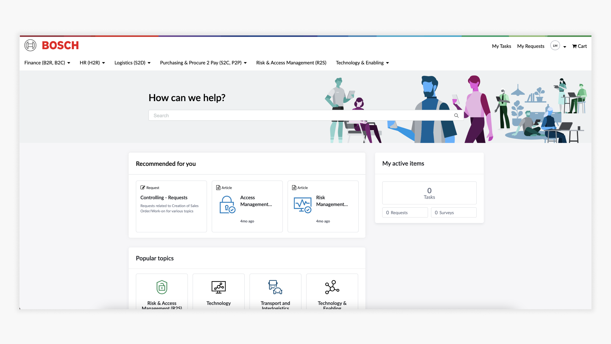
Home page before.
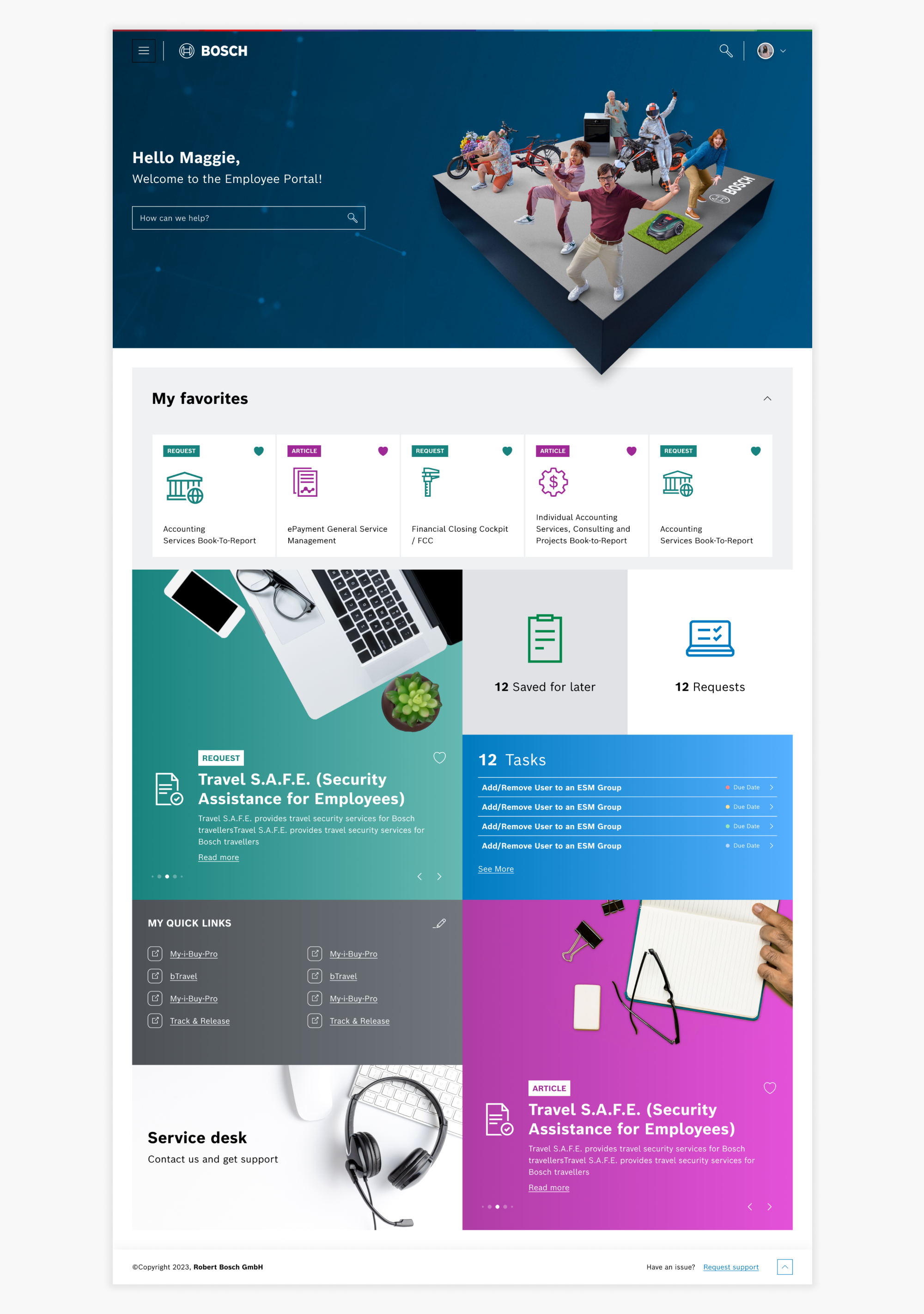
Home page after.
Menu
Challenge: The main navigation was difficult to spot, and users often overlooked the menu entirely.
Solution: The redesign made the menu more prominent with larger headings and improved placement for visibility.
Challenge: The menu structure was overwhelming and cluttered, making it hard for users to find what they needed quickly.
Solution: Reorganized the menu into simpler two-column layouts with grouped categories and added a search bar directly into the navigation.
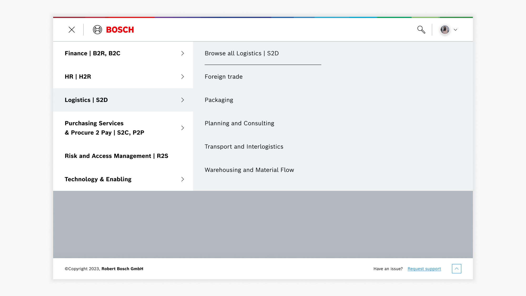
Menu after.
Search results
Challenge: Titles and icons in result tiles were often unclear, making it hard to know what each result referred to.
Solution: Standardized card layouts and icons with clear titles and subtitles to improve readability and scannability.
Challenge: Search often returned overwhelming results and failed to recognize synonyms or partial terms, making it difficult for users to find what they needed.
Solution: Improved search logic with richer metadata and synonym support to deliver more accurate and manageable results.
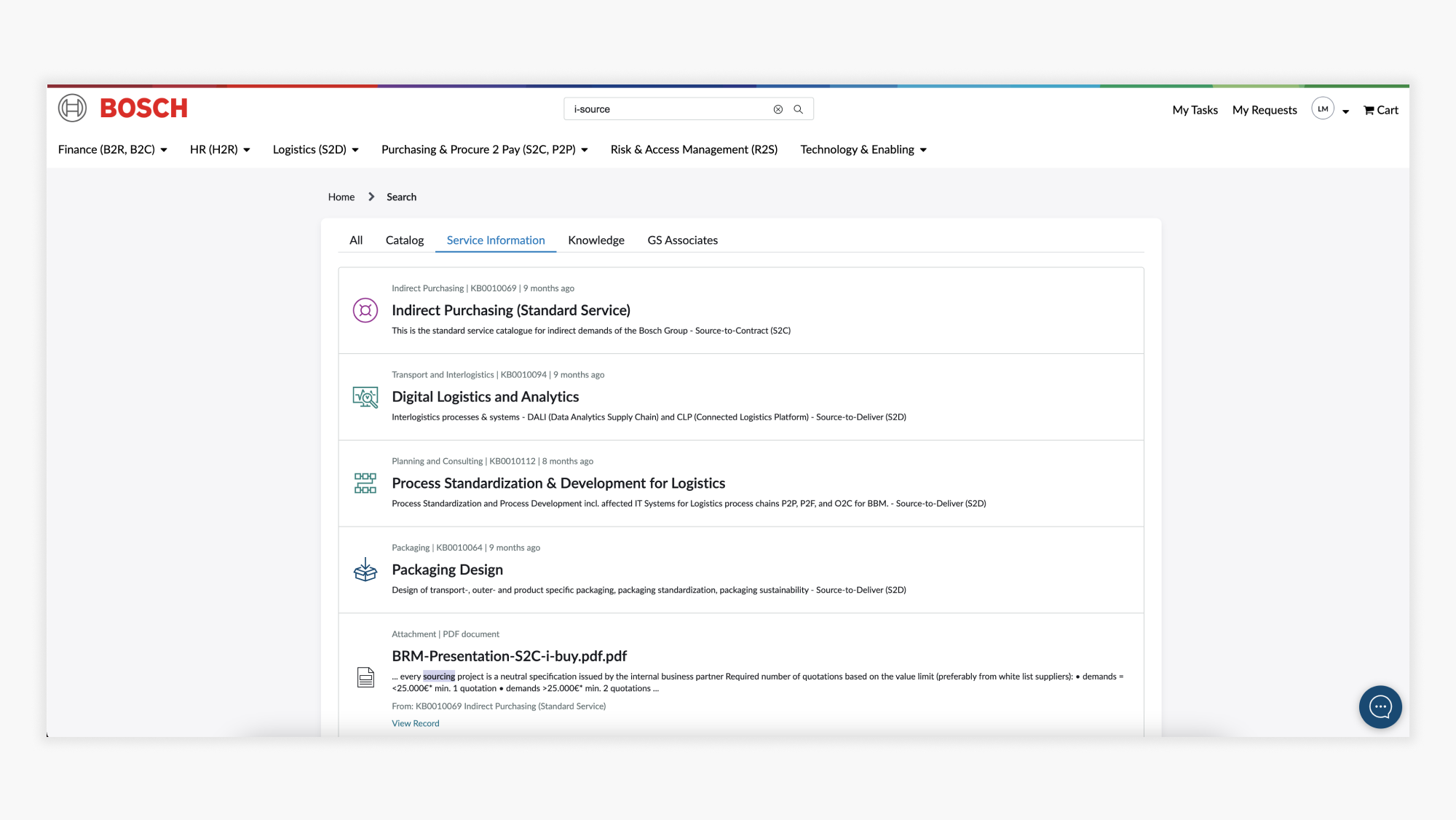
Search results before.
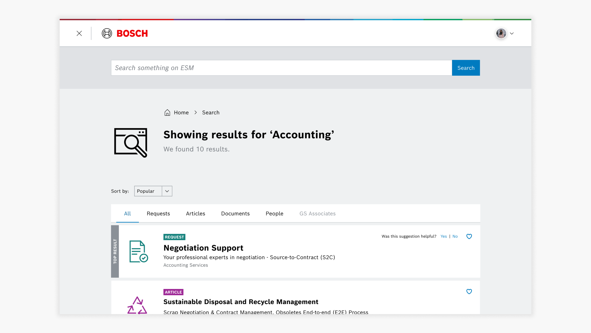
Search results after.
Articles
Challenge: Articles were long, text-heavy, and lacked clear structure, making them hard to scan and overwhelming to read.
Solution: Redesigned articles with a clear heading hierarchy, accordion sections, bullet formatting, and structured content blocks to improve readability and visual flow.
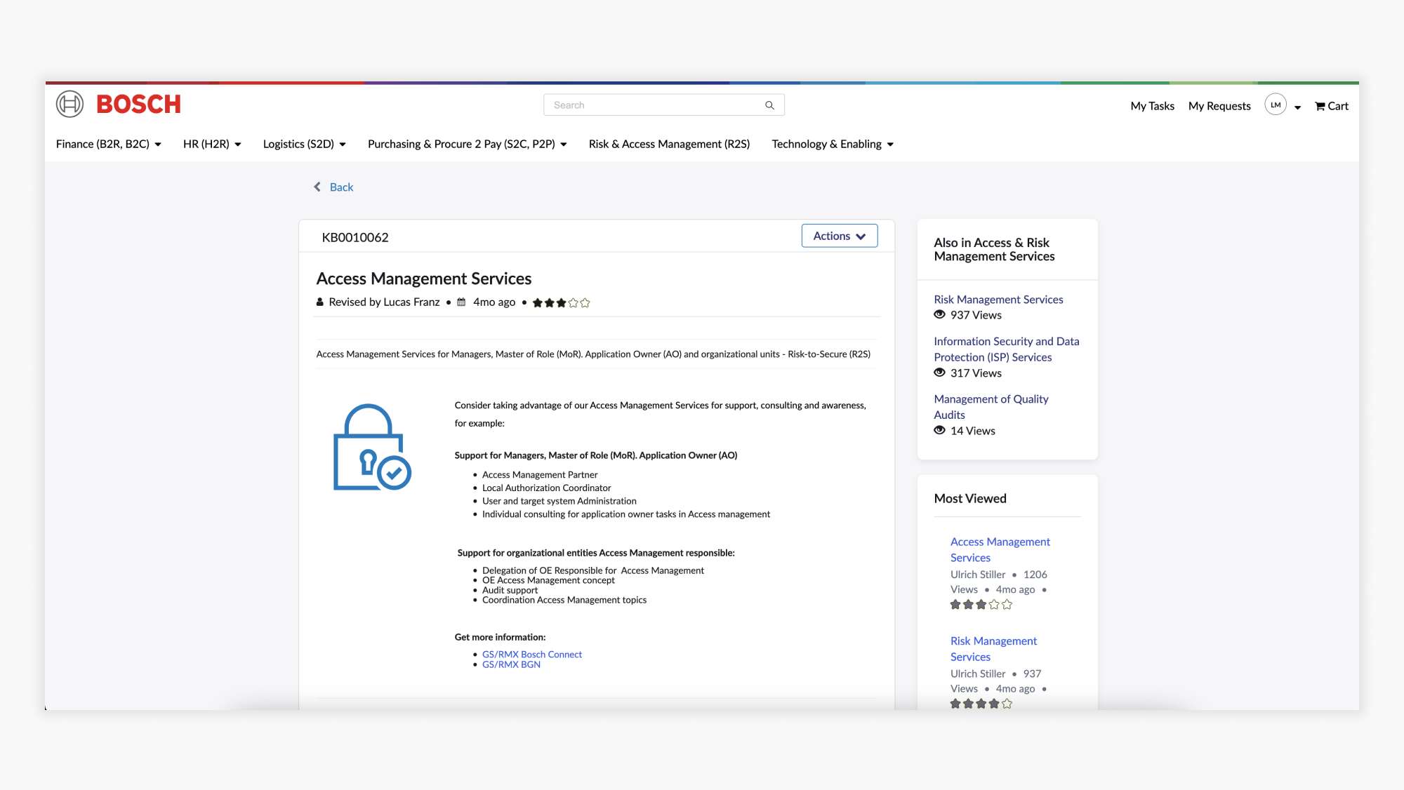
Article before.

Article after.
Request forms
Challenge: Request forms were too long and unstructured, forcing users to scroll through excessive fields without a clear order.
Solution: Forms were broken into logical sections with grouped fields in a two-column layout, making them easier to complete. To ensure consistency across the portal, I also created a UX Rule Book for service owners with best practices on structuring and writing request forms

Request before.

Request after.
Impact
- Secured stakeholder buy-in for the redesign; despite initial resistance and belief that the out-of-the-box solution was sufficient, the findings proved a full redesign was essential for adoption and efficiency.
- Delivered simplified navigation, streamlined workflows, and clearer service naming.
- Ensured full alignment with Bosch’s brand guidelines and design system.
- Helped Bosch GS advance to UX Maturity Level 3, recognized by the central UX department.
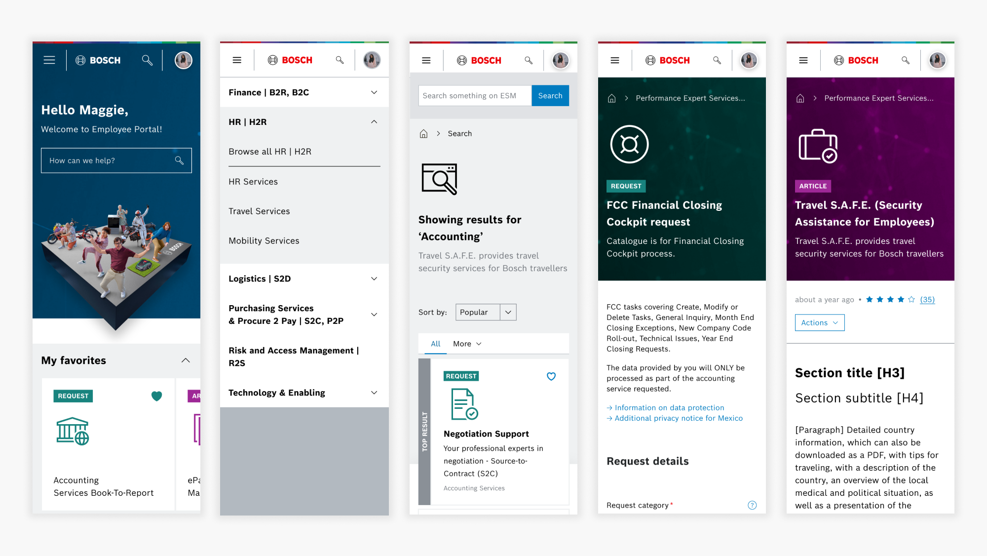
Mobile versions of the screens.
My Takeaways
- The research would have been even stronger with more influence over recruitment, as the user pool lacked the diversity we recommended.
- Since sessions couldn’t be recorded, we relied on detailed notes and immediate debriefs, which led to more accurate and less biased analysis.
- Despite internal resistance and technical constraints, I saw it as our role to challenge assumptions and bring an outside perspective to drive impact.
Next steps
The redesigned portal addressed the most critical usability challenges uncovered during research, now the next step is to test it with employees to validate the solutions.
After launch, I recommend monitoring key metrics such as:
- Task completion rate and time: how quickly and accurately employees can submit and track requests.
- Search success rate: whether employees are finding the right services and information efficiently.
- Error rates in request forms: frequency of incomplete or incorrect submissions.
- Employee satisfaction scores (CSAT or SUS): gauging overall usability and confidence in the portal.
- Adoption and engagement levels: how frequently employees use the portal compared to legacy channels like email.
By continuing to measure these outcomes, Bosch can ensure the portal not only meets initial expectations but continues to evolve into a truly employee-centered platform.