Wireframing with clients: cocreation to inspire confidence in investors of a digital medical school
Client Global Health Education Group
Agency Livework São Paulo & London
Year 2021
My role I solely designed the user interface, from ideation and wireframing through high-fidelity prototyping
Overview of the user interface.
Summary
Global Health Education Group is an early-stage startup contributing to avoid a global shortfall of 18 million healthcare workers predicted by 2030. To achieve this, they propose a new model of health education, where students anywhere in the world receive consistent, high-quality training and learning experience. GHEG is seeking funding to jumpstart this mission and has reached out to Livework to help them inspire confidence in potential investors by bringing their idea to life.
The main deliverable of the project was a high-fidelity, interactive prototype designed with the input of the clients, medical educators, and students. This prototype is currently being used in meetings with investors and will also help shape the platform as soon as the company is up and running.
The main challenge of the project was translating the clients’ vision, and aligning it with the research findings and industry best practices to design the first platform specifically for healthcare training. To tackle this, I conducted weekly co-creative sessions with the clients and medical education experts to iterate low-fidelity wireframes, evolving into a high-fidelity, interactive prototype that achieved the clients’ expectations, reflected realistically the particular needs of health education and looked appealing to potential investors and users.
Outcome
Sometime after the end of the project, the clients were able to secure funding to start offering their services to universities and governments.
Full case study ︎︎︎
Context
Global Health Education Group, an early-stage startup, was created to tackle the global shortfall of 18 million healthcare workers that is predicted by 2030.
To achieve a world with high-quality healthcare for all without health staff shortages, a new model of health education is proposed: an edtech platform dedicated to health education, populated with world-class content, accredited by leading universities and educators and delivered by a credible team.
Opportunity
To make this happen, GHEG is looking for funding to launch the platform. To help them inspire confidence in potential investors and bring their idea to life, we proposed creating a Visiontype: a high-fidelity, interactive prototype of the platform, with the goal of painting a picture of the product’s future. It’s a way to demonstrate the concept in a realistic way, without getting lost in the technical details. This will be the focus of this case study.
Along with the prototype, we also created a video showcasing the context of use of the platform, brand identity for GHEG and a brochure for investors.
Research
The project started with various research activities, led by our Service Design Lead, Debbie Bryant, which were a solid foundation for the user interface design work done later on.
- Desk research: exploring about the world of e-learning and its tools.
- Interviews with the clients: understanding brand aspirations, unique selling propositions, direct and indirect competitors, best sources of information.
- Workshops with clients: coming up with hypothesis, a lean canvas, vision and proposition statements.
- Medical student journey mapping workshop: mapping out phases, activities, values, needs, hypothesis, product touchpoints and other insights from the student journey.
- Interviews with medical education experts: getting to know them, their experience, their perceptions of current medical degrees and reactions to the value proposition and to the vision.
- Interviews with medical students: challenges, barriers and opportunities with current medical education, reactions to the value proposition and to the prototype.
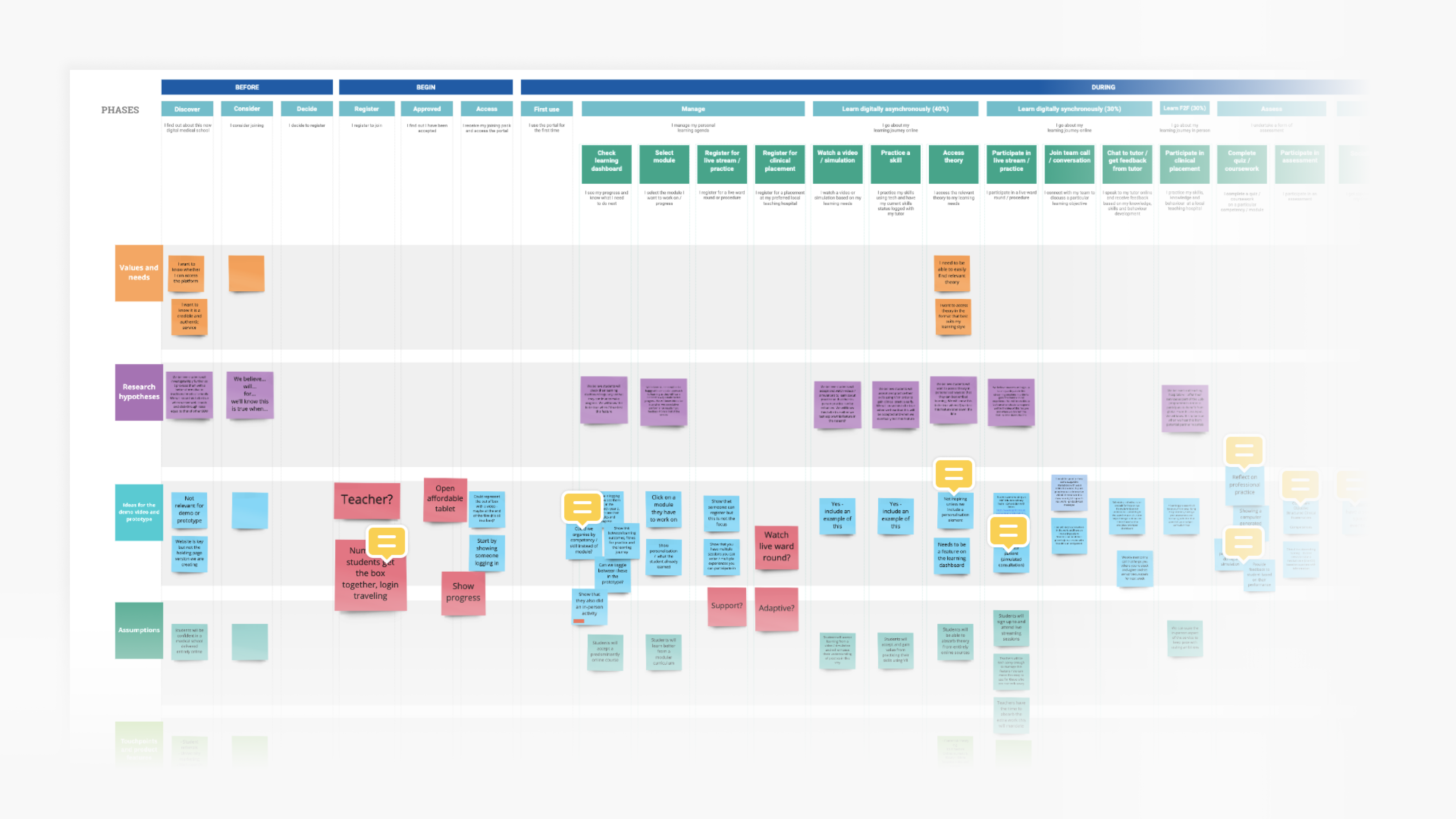
Medical student journey map.
Ideation
The clients came with a clear vision of what their product should look like. They brought a lot to the table, and it was my responsability, and challenge, to align those ideas with the research findings and industry best practices.
For this stage, I chose low-fidelity wireframes as a tool to quickly give life to the ideas so we could discuss and evolve week by week. Here are a few examples of how it happened.
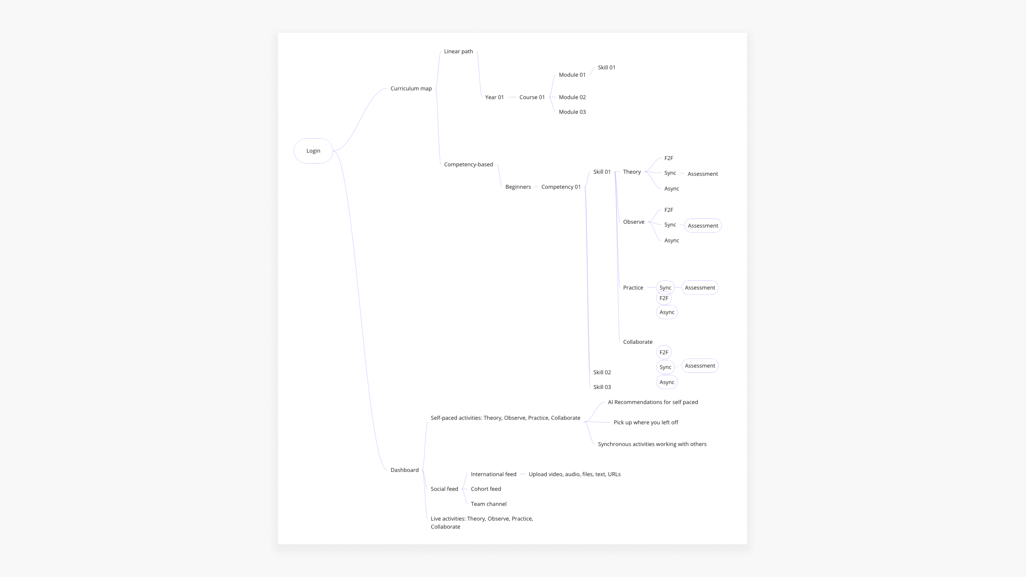
Early information architecture of the platform.
Home screen
The home screen of the platform should offer a bird’s eye view of their student life - ongoing activities, progress metrics, upcoming events, messages, alerts, etc.To kickstart the discussion, I designed the first version of the home screen wireframe with elements from social network feeds and existing e-learning tools. This was a quick way to understand which way not to go:
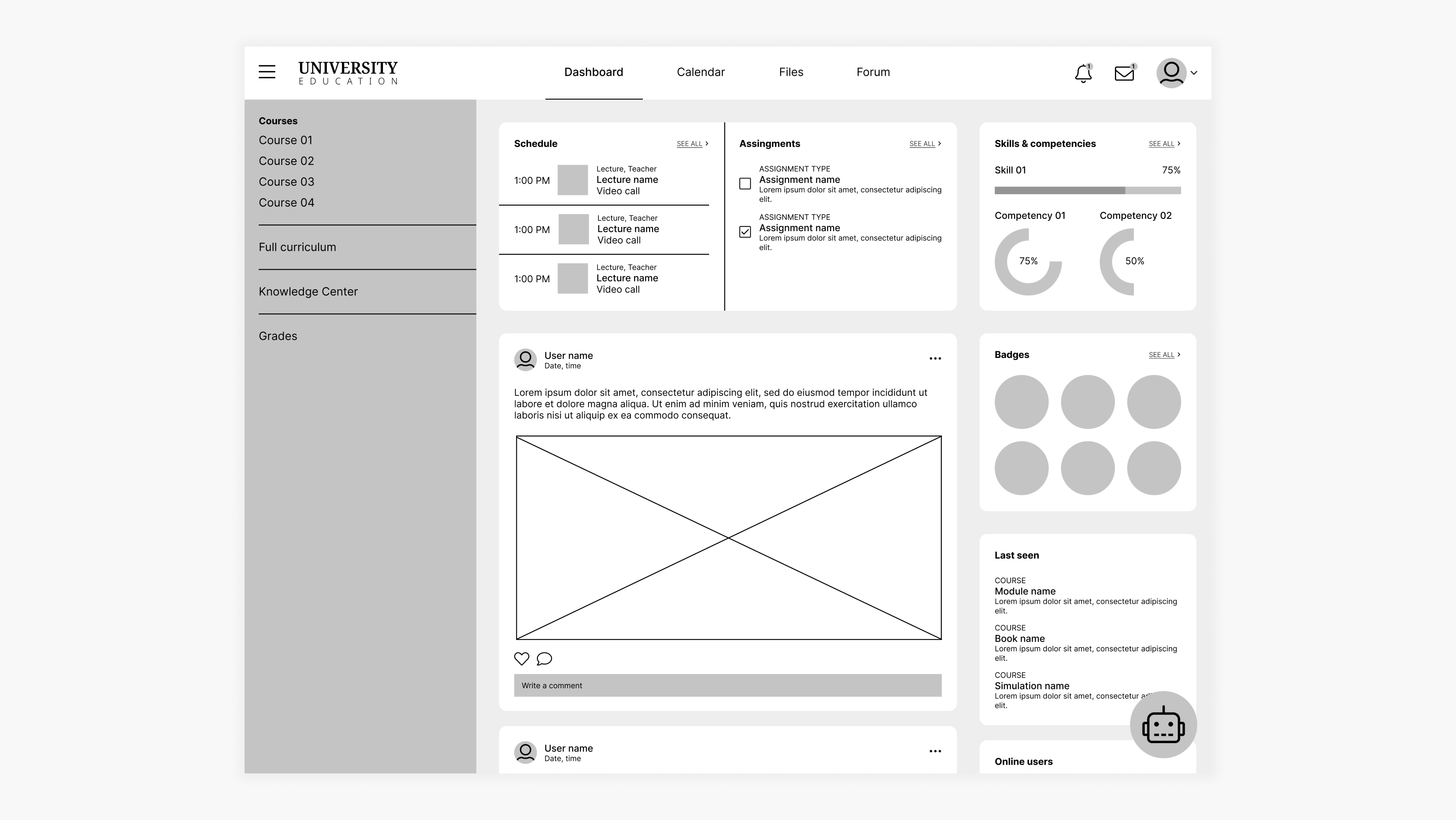
First version of the home screen wireframe.
Main feedbacks:
- Feels complicated and busy;
- Looks like traditional e-learning tools, which isn't well suited to medical education and it’s what the clients are looking to disrupt;
- Lacks personalization;
From then on we experimented on different ways to show what needs to be done in the student’s week, change the focus from grades to continuous assessment, highlight scheduled and self-paced activities, move away from traditional teaching methods such as lectures into bite-sized activities and think about innovative strategies to go about collaboration and community among students.
Different iterations of the home screen.
Curriculum map
This is where the students will be able to access all the content from the course - classes, activities, simulations, etc.]Competency-based approach
During our weekly cocreative sessions, we experimented on many different approaches to view and navigate the curriculum map. The traditional way is to go from one module to the next. We wanted to offer an alternative, where the student could focus on the competencies behind each module instead.For example, instead of taking the Endocrinology 1 module, the student could focus on mastering the “Obtain a capillary blood glucose reading” competency, which will be made up of activities from that module but also others.
For this purpose, I added a toggle switch to the curriculum map page so that the student could easily change from one view to the other. The student could track their progress on the competencies in both views through the circular charts.
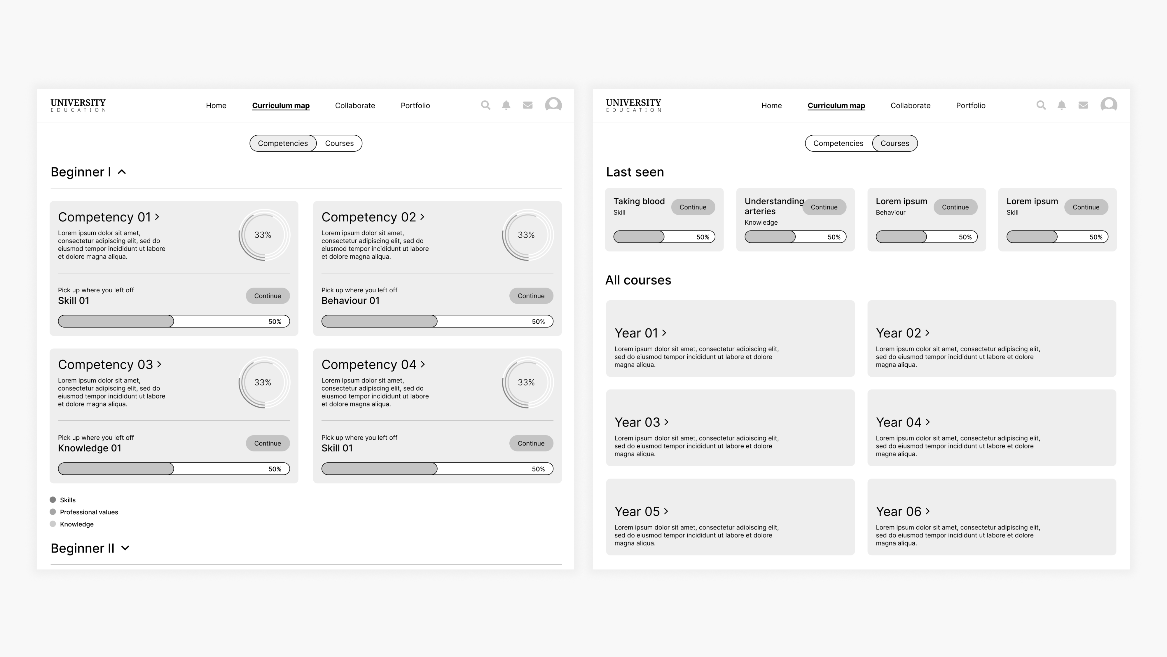
Initial wireframes of the Curriculum Map.
In the final prototype, the competency-based approach was discarded by the advice of a medical education expert. The traditional modules will remain, with the addition of a medical case-based approach that will underpin the student’s learnings that week. However, we kept the competency views as a way to track student progress.
Whiteboard approach
Another idea we wanted to bring to life was inspired by whiteboard tools such as Miro and FigJam: design the curriculum map in a way that the students could have almost total freedom to organize it the way they wanted to and use it as a blank canvas, almost.Here we decided to organize the curriculum by years and courses, and inside each module the activities were divided by skill, behavior and knowlege - outcomes of that module. These elements were designed with inspiration from Kanban tools, such as Trello.
My approach was to bring some structure by organizing the curriculum elements inside frames. I designed a toolbar on the left side of the screen, in a way that users are already familiar with, which they could use to add sticky notes, text, scribbles, files. Progress charts were also added.
Prototype created to demonstrate the whiteboard approach.
This approach to the curriculum map was discarded for technical feasibility reasons. Instead, we added a simpler whiteboard tool to the Collaborate feature.
Collaborate
Since this will be a mostly online course, it’s very important that the platform give students opportunities to create bonds and collaborate with each other.Taking a page from the book of current e-learning tools, my first approach was to add a social feed to each module page. The idea was that the students could have discussions on the same place they could read theory, observe and practice that particular topic.
First version of the collaborate wireframe.
After the first round of discussion, it became clear that what was proposed wasn’t enough to facilitate the integration of students.
During the following iteration rounds, a chat feature was added to help students communicate amongst each other and inside groups. Those chats can also turn into whiteboards for freehand collaboration, where they can add post-its, images, videos, drawings and more.
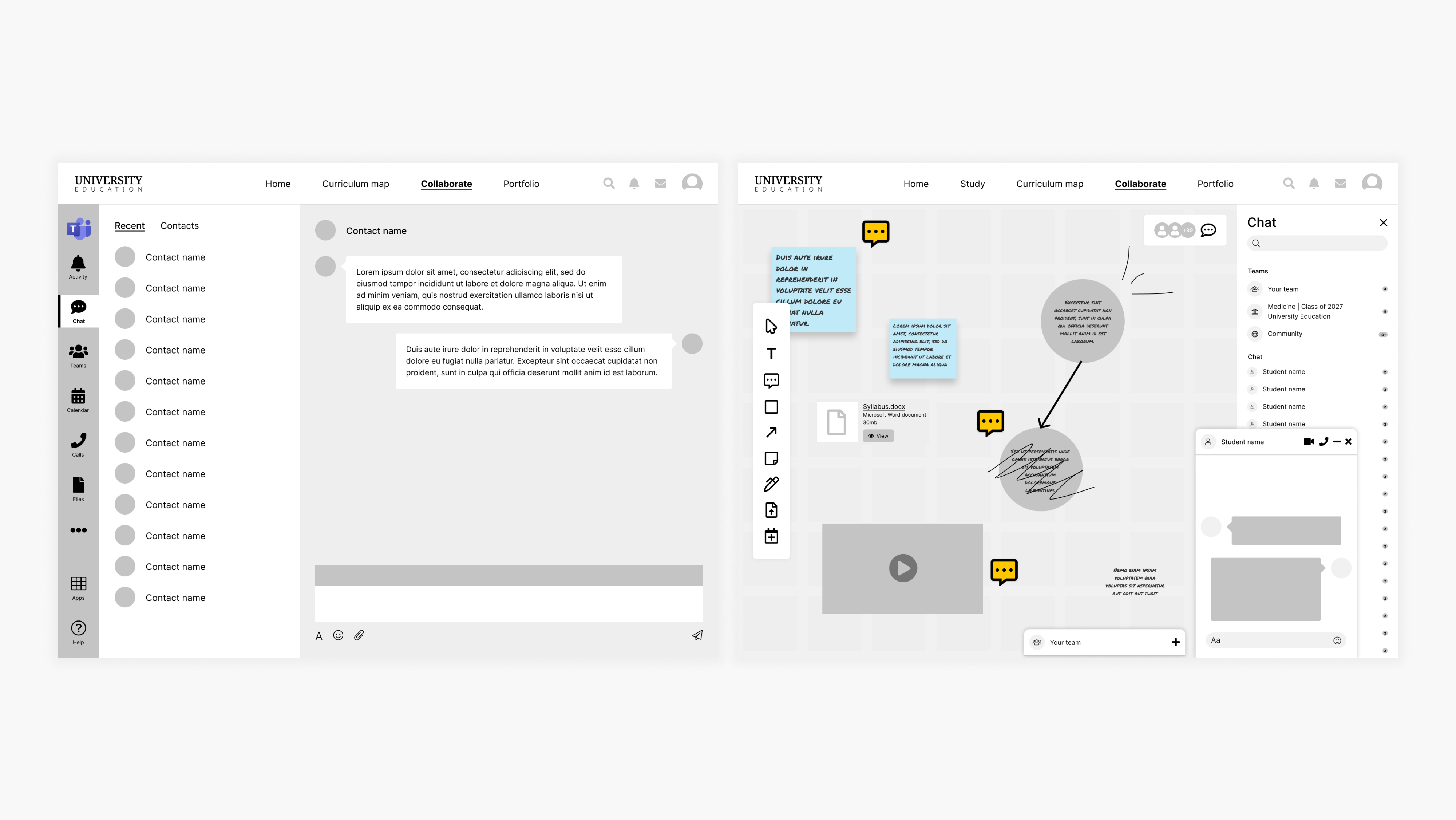
New version of collaborate wireframe.
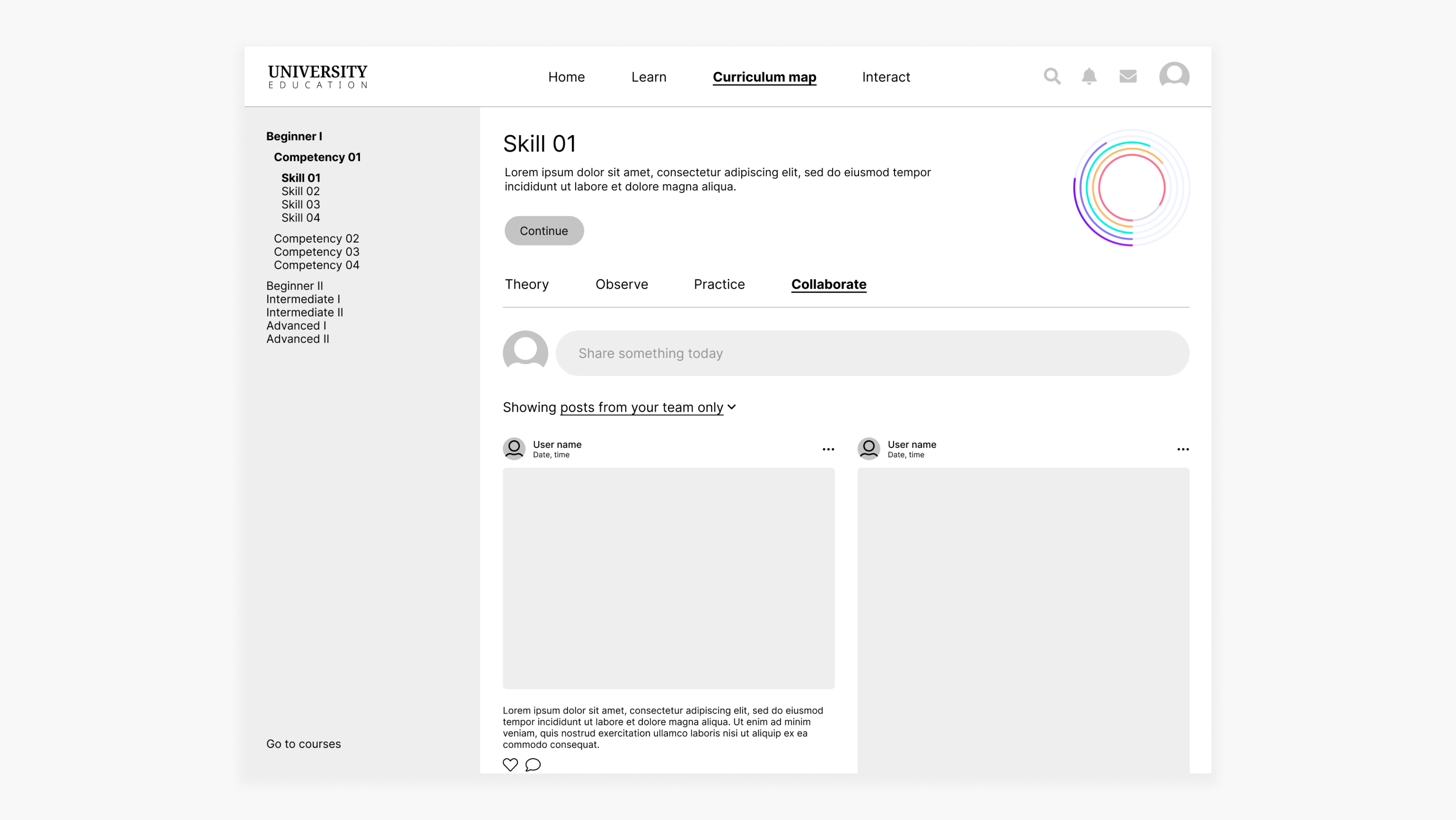
Also, a collaborate toolbar was added to activity pages. This toolbar acts as a shortcut to some collaboration tools, allowing students to add notes and files, and also chat about that particular topic.
Wireframe of the content page with the collaborate toolbar - different iterations.
Validation
After several rounds of iteration, we arrived at a place with the wireframes where we felt confident enough to present to actual medical students and gauge their reactions. This wasn’t a usability test, but an exploratory interview conducted by our Service Design Lead.
The results of the interviews are confidential but overall, the wireframes were very well received by the students. They liked many of the features, especially the case-based approach and progress information. Also, a number of respondents felt the information was well laid out and clearly presented. Most importantly, they thought this tool would be useful to them.
Final prototype
On top of validating our designs, we were also able to extract many insights from the exploratory interviews. All these findings were taken into consideration during this next stage of the project, the design of the high-fidelity, interactive prototype. Here is the final result:
Experience concept video produced by Pedro Martins e Souza and Fabio Vaccas.
Branding designed by Victor Alves.
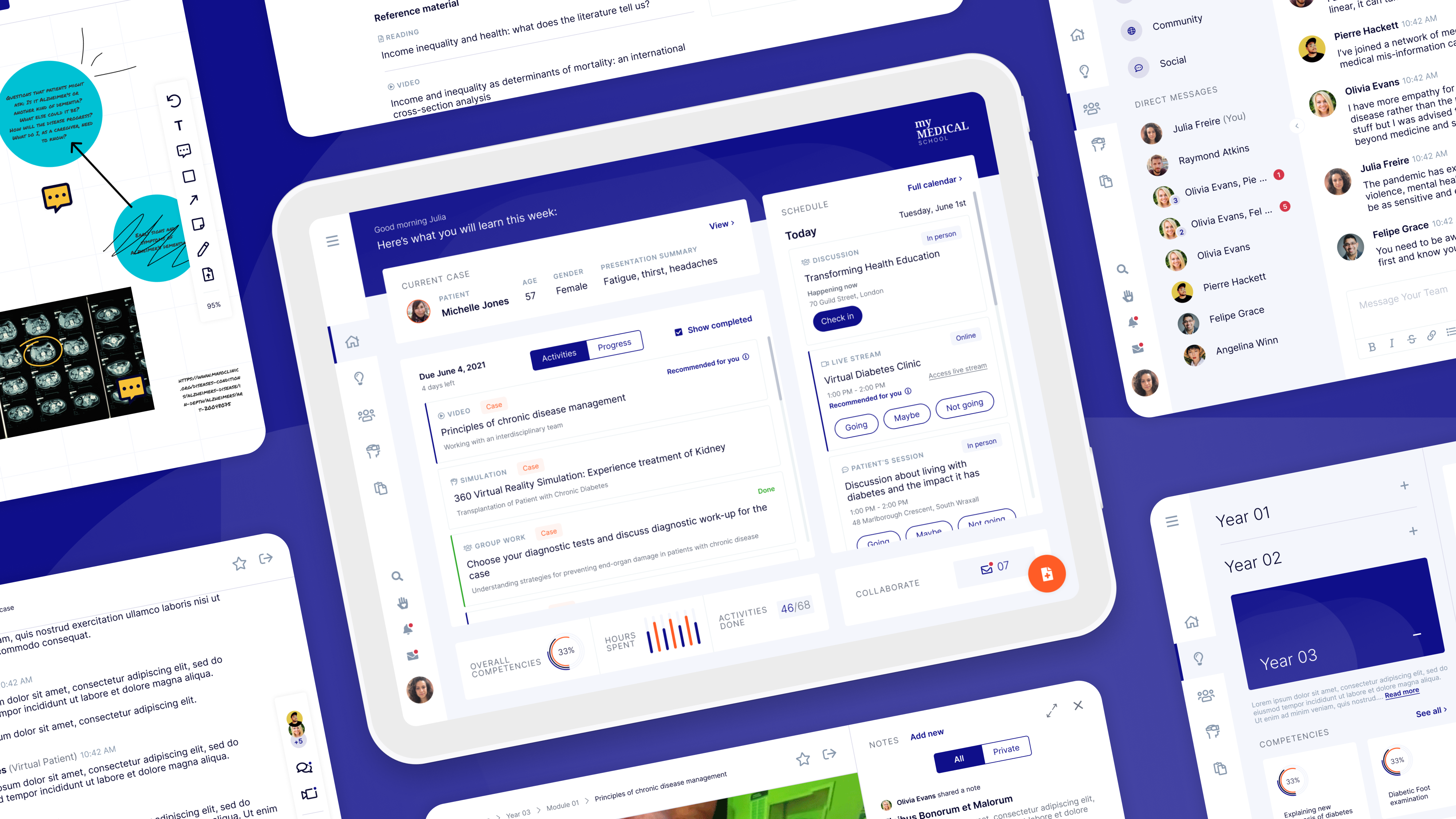
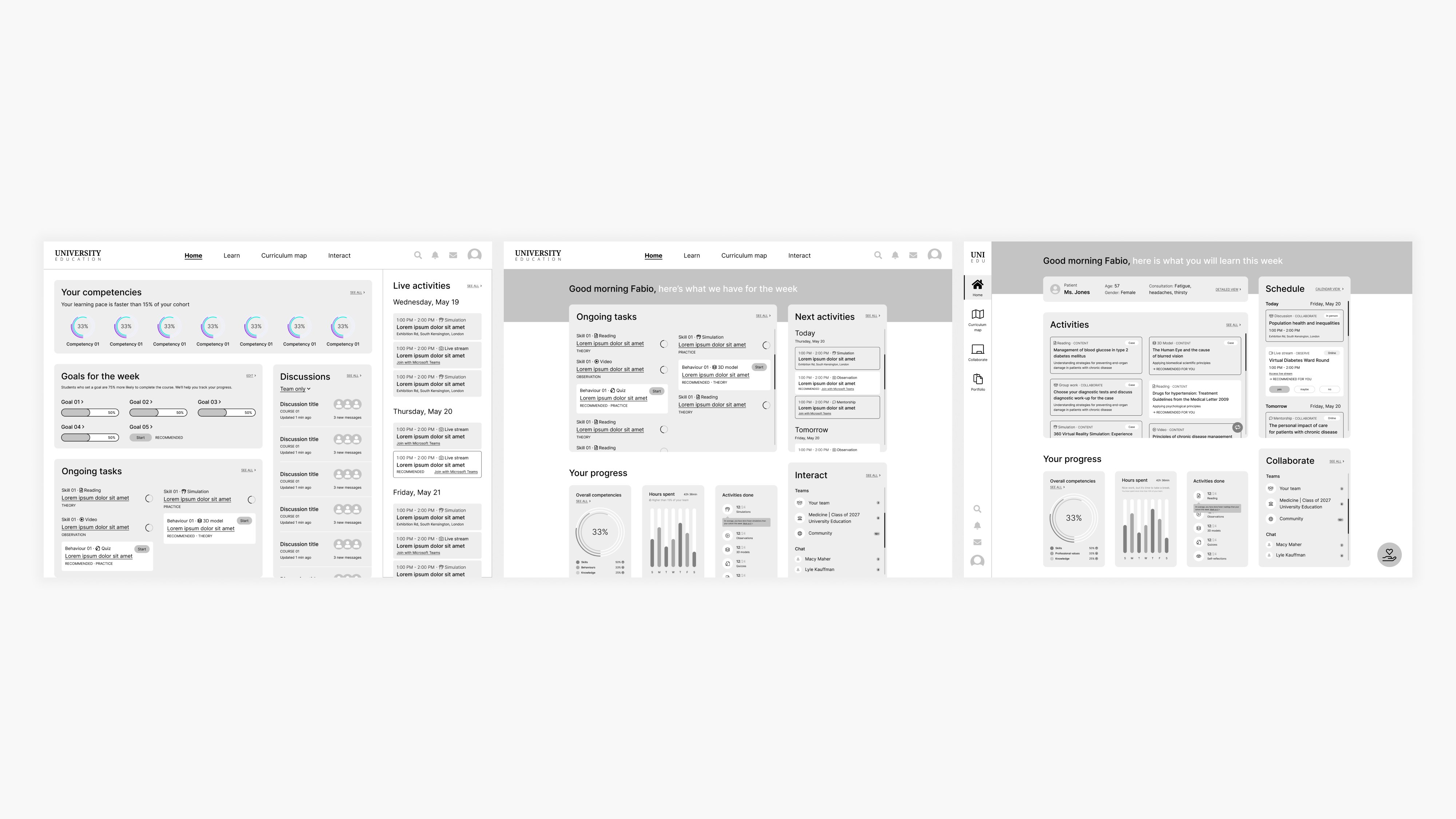
Home screen
Each week, a new clinical case related to the students’ current classes and activities is assigned to them. This is the so-called case-based approach. After logging in, a snippet of the current case is seen at the top of the home screen. By clicking on it, the full detais are shown.The students log in, view the home page and then tap to find the complete details of the current clinical case.
On the box below, the students find their activities for the week. By tapping the toggle switch, they are able to check their progress on the competencies they are working on that particular year.
The students view their activities and progress.
On the bottom of the screen, the students find a snippet of their stats. If they click, they are able to see this information in a more detailed way.
On the right side of the screen, the students have a preview of their schedule and are able to RSVP to activities right then and there. If they are attending an in-person activity, they can also check in without leaving the home screen.
The students check their stats, check in during an in-person activity then RSVP to a live stream.
Learn
As previously mentioned, the module-based approach was chosen for the curriculum map. However, we still integrated the competencies which will be tracked year-round and the clinical case will also influence how the students navigate their studies.To accommodate all these requirements, the screen has been divided according to the hierarchy: years and competencies on the left side, modules and its activities on the right side.
By clicking on a competency, there is a breakdown of what comprises it and the related activities.
From the home screen, the students access the curriculum map and have a detailed view of a competency.
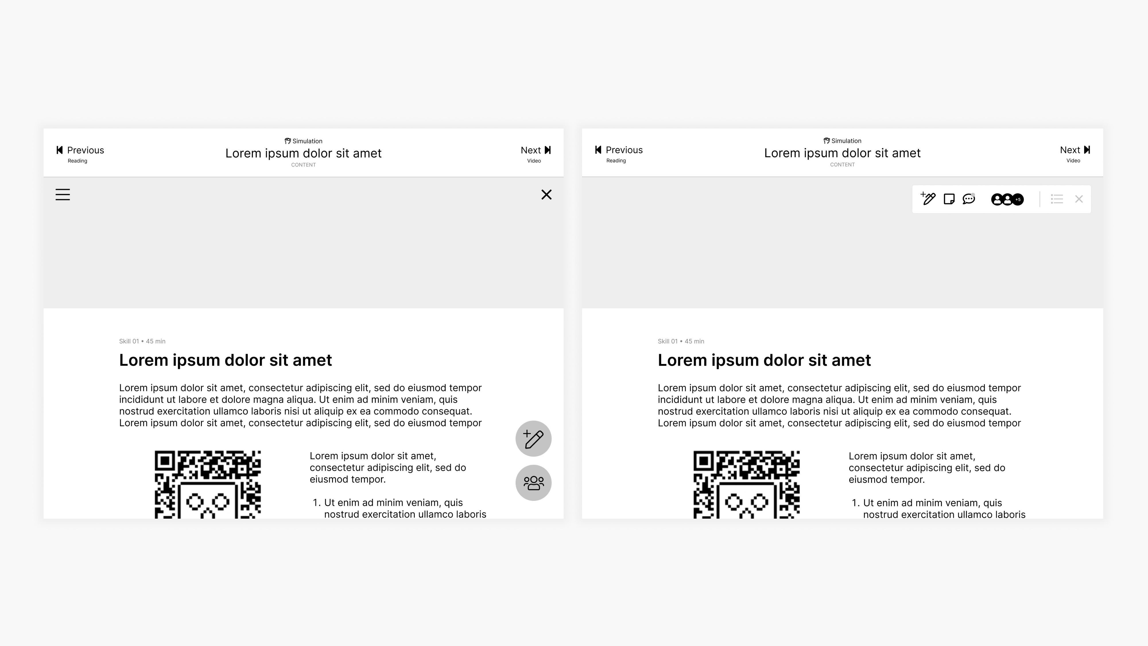
Activity
The activity page looks different, depending on its type. Here are a few of them: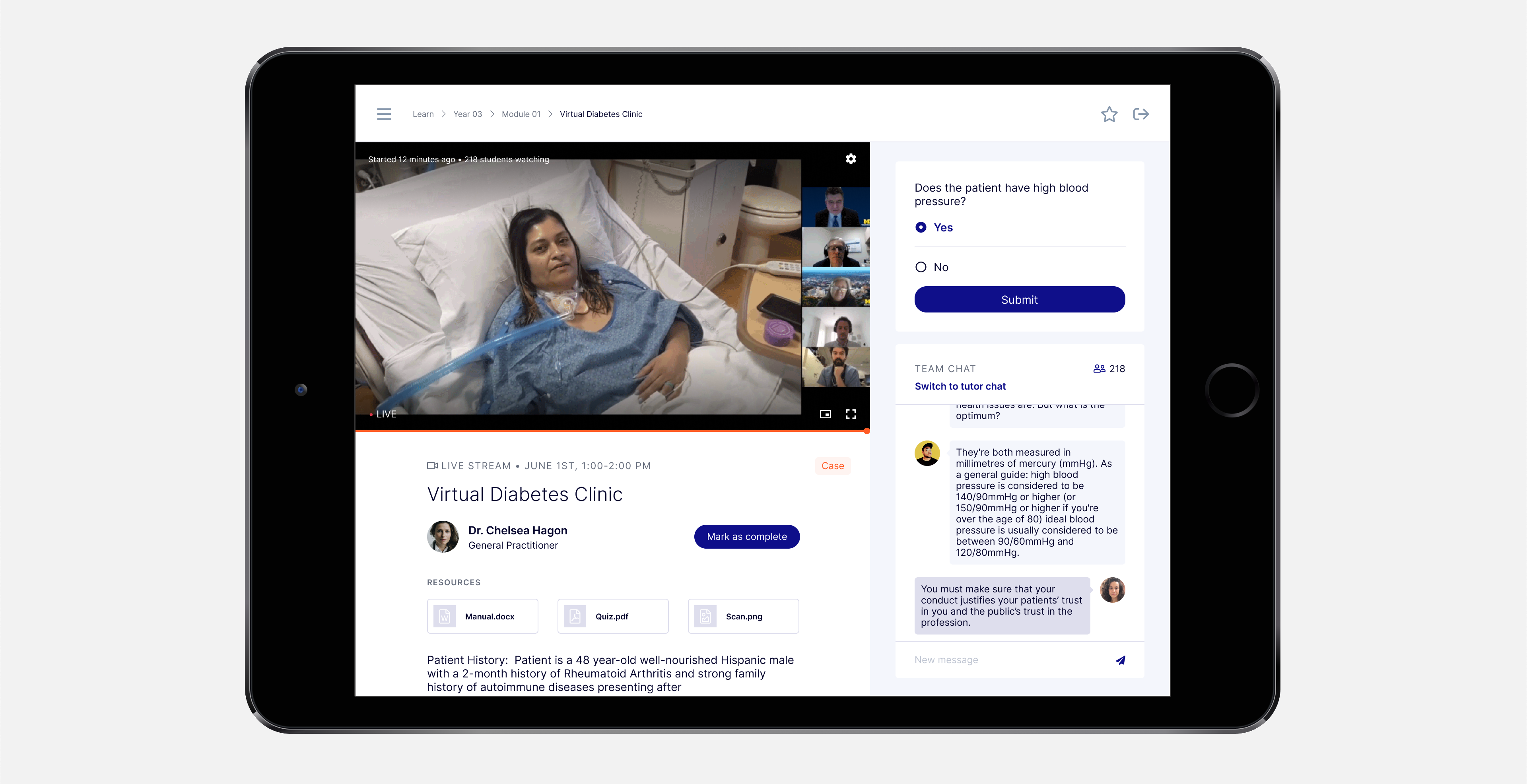
Live stream: a teacher broadcasts live a real ward round. Here the students can read about the case, answer quizzes and chat live amongst themselves and with the teacher.
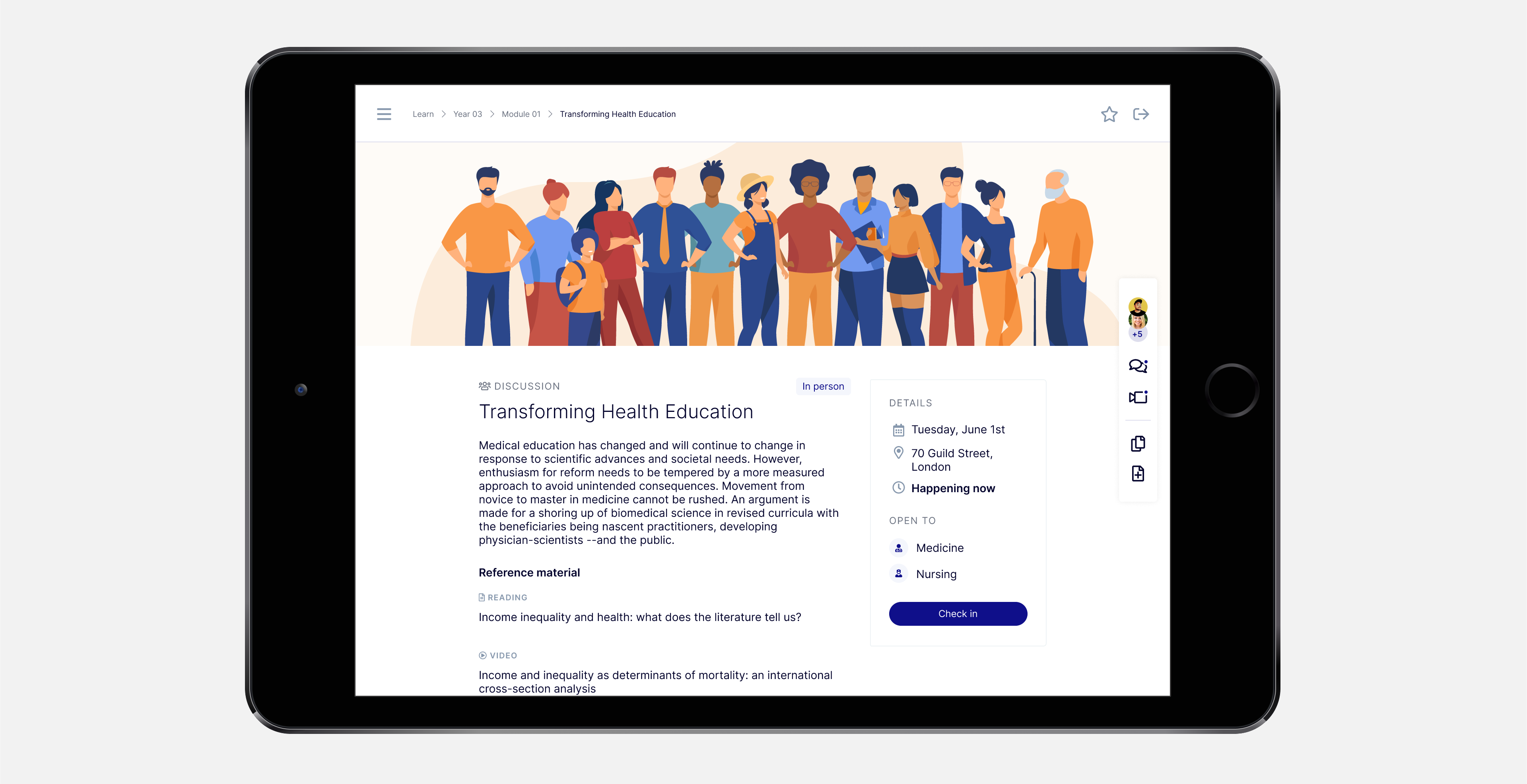
In person events: students are able to find details, reference material and RSVP. They can also check in when they arrive to mark their presence.
Simulation: students can practice real medical procedures through VR glasses, which can be connected via the QR Code on the screen. Afterward, they can upload this achievement to their portfolio and schedule to practice this skill in person.
Collaborate
A chat feature, with one-on-one and group chats that also turn into a whiteboard for freehand collaboration.From the home screen, the students access the chat room and then it switches to the whiteboard view.
The collaborate feature is also present during the activities through the sidebar on the left. Because of it, students are able to chat, share notes (privately or publicly), articles, photos and other media related to that activity. They are also able to see who else is viewing that activity at that time.
The student uses the collaborate feature on the 360º video activity page.
Reflect
At the end of the undergraduate journey, medical students need to gather evidence of their learning achievements and abilities in order to apply for internships and graduate.The portfolio is a way for students to register their achievements as soon as they happen. This way, they wouldn’t have to rely on their memory at the end of their studies and it would also encourage constant self-reflection, a professional skill they will need for medical practice.
From the home screen, the students access the portfolio with notes, achievements, self-assessments and the latest badges earned. To add something to the portfolio, they click “New entry” at the top of the screen.
Outcome
As previously stated, the clients were able to secure funding to start offering their services to universities and governments after the end of the project. Also, they are in the midst of exploring additional ventures with Livework.
My takeaways
1. Wireframing is a great tool for cocreating with clients who already have a well-established vision of their product because they are able to fill the gaps between the grey elements and the to-be finished product, making for excellent discussion in the iterative process.
2. The flip side of working with clients with a well-established vision is that it’s easy to just go with the flow and execute their idea. However, while they might be experts in their field, they are not their users. This is where the importance of research comes into play, it’s extremely important to ally the client’s vision with the research findings and the designer’s expertise. Even though it may take some convincing on the client’s side.
3. Balancing user- and client-centricity is key for a project like this, geared toward potential investors and not development straightaway.
Client feedback
“Just wanted to say that the [investor] meeting went very well. [The investor] was very engaged, the prototype looks fantastic, and I think we received some great feedback.” - Client 01
“I’m very happy with the work and the process so far. I feel really confident in the work and our dynamic with Luiz has been great during the architecture interface sessions.” - Client 01
“Just a brief note to say that I think the visiontype is looking amazing. Luiz and the team have been doing a fabulous job. It’s at the same time what I had in my head but also even better. A little bit more to do but how it’s come to life over the last couple of days has been a joy to watch! Well done everyone.” - Client 02